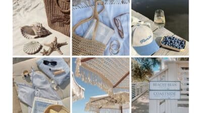
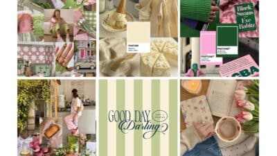
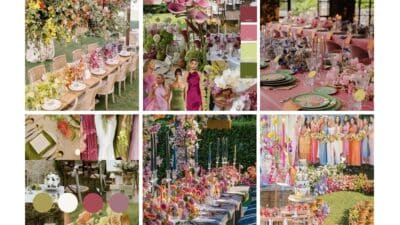
Choosing your wedding color palette is one of the most exciting parts of planning your special day. It sets the tone for your entire celebration and influences everything from your flowers to your bridesmaids’ dresses. Your wedding colors should reflect your personal style, the season of your ceremony, and create a cohesive look that guests will remember long after the last dance.
Whether you’re drawn to classic elegance with creams and blush, or bold statements with deep purples and oranges, the right color scheme ties your wedding elements together beautifully. Many couples now blend traditional palettes with unexpected pops of color to create unique, personalized celebrations that showcase their personalities.
Key Takeaways
- Your color palette influences every visual aspect of your wedding, from invitations to decor, making it a crucial early planning decision.
- Seasonal considerations can provide natural inspiration for wedding colors, with each time of year offering distinct palettes and floral options.
- Combining complementary colors and incorporating meaningful hues can create a personalized wedding atmosphere that reflects your unique relationship.
Exploring Color Palette Foundations
Your wedding color palette sets the visual tone for your entire celebration, influencing everything from your invitations to floral arrangements. Creating a cohesive and meaningful color scheme requires understanding the basics of color theory and recognizing the significance these choices have in your overall wedding design.
Importance of Choosing the Right Wedding Colors
Your wedding colors aren’t just decorative elements—they’re the visual foundation of your special day. They appear in nearly every aspect of your celebration, from attire to table settings. When thoughtfully selected, your color palette ties everything together beautifully.
Seasonal considerations can help guide your choices. Spring and summer weddings often feature lighter tones like blush, champagne, and soft blues, while fall and winter celebrations may incorporate deeper hues like burgundy, forest green, or navy.
Your venue should influence your color decisions too. A rustic barn might pair wonderfully with terracotta and sage, while an elegant ballroom might call for classic ivory and gold accents.
Remember that your wedding colors should reflect your personality as a couple. Whether you prefer timeless combinations like white and green or bold statements like emerald and fuchsia, choose colors that resonate with you both.
Understanding Color Theory in Wedding Design
Color theory provides a framework for creating harmonious wedding palettes. The color wheel is your best friend here—it helps you identify combinations that naturally work together.
Complementary colors (opposite on the wheel) create dynamic contrast. Think purple and yellow or blue and orange for a vibrant celebration. Analogous colors (next to each other) offer a more subtle, cohesive look, like blush, coral, and peach.
The emotions colors evoke matter too. Warm tones like red and orange feel energetic and passionate, while cool blues and greens project calmness and serenity.
Consider incorporating a neutral base with 1-2 accent colors for balance. White, cream, or gray provide excellent foundations that let your accent colors shine without overwhelming your guests’ senses.
Your accent colors can appear in smaller doses through bridesmaids’ bouquets, table runners, or ribbon details. This approach creates visual interest while maintaining elegance and preventing your palette from feeling chaotic.
Seasonal Wedding Color Inspirations
Choosing wedding colors that align with your wedding season can enhance the natural beauty of your surroundings and create a cohesive atmosphere. The perfect palette can transform your venue and complement the seasonal elements already present.
Spring Wedding Colors: Blossoming Hues
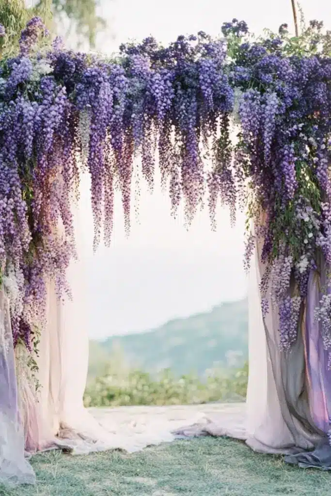
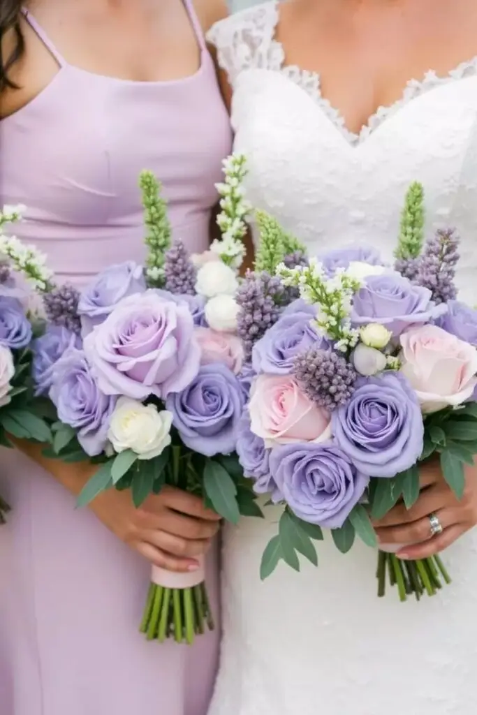
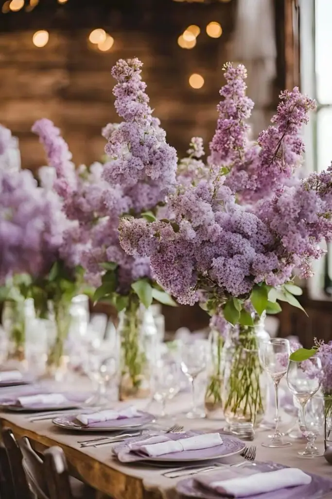
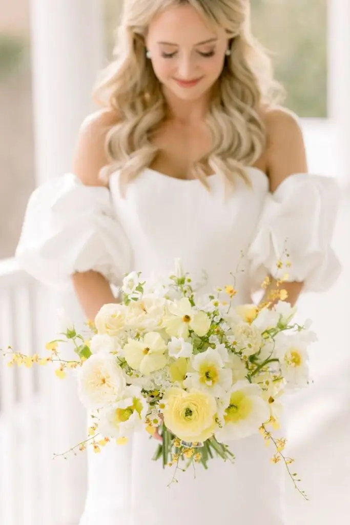
Spring weddings offer a magical backdrop of renewal and freshness. Pastels reign supreme during this season, with lavender, pale pink, soft yellow, and baby blue mimicking the natural blooming landscape.
Popular Spring Color Combinations:
- Blush pink and sage green
- Lavender and cream
- Soft yellow and powder blue
- Mint and peach
These gentle tones create an atmosphere of romance and new beginnings. For May weddings, consider incorporating lilac and mint for a refreshing combination that mirrors the vibrant growth of late spring.
Don’t feel limited to pastels though! A pop of brighter hues like coral or turquoise can add personality while still feeling seasonally appropriate.
Summer Wedding Elegance: Bright and Bold Selections
Summer calls for vibrant, sun-drenched palettes that capture the energy of the season. Your summer wedding can shine with bright colors that stand out against lush greenery and blue skies.
Stunning Summer Palettes:
- Coral and teal
- Bright yellow and navy
- Seafoam green and fuchsia
- Tiffany blue and chiffon yellow
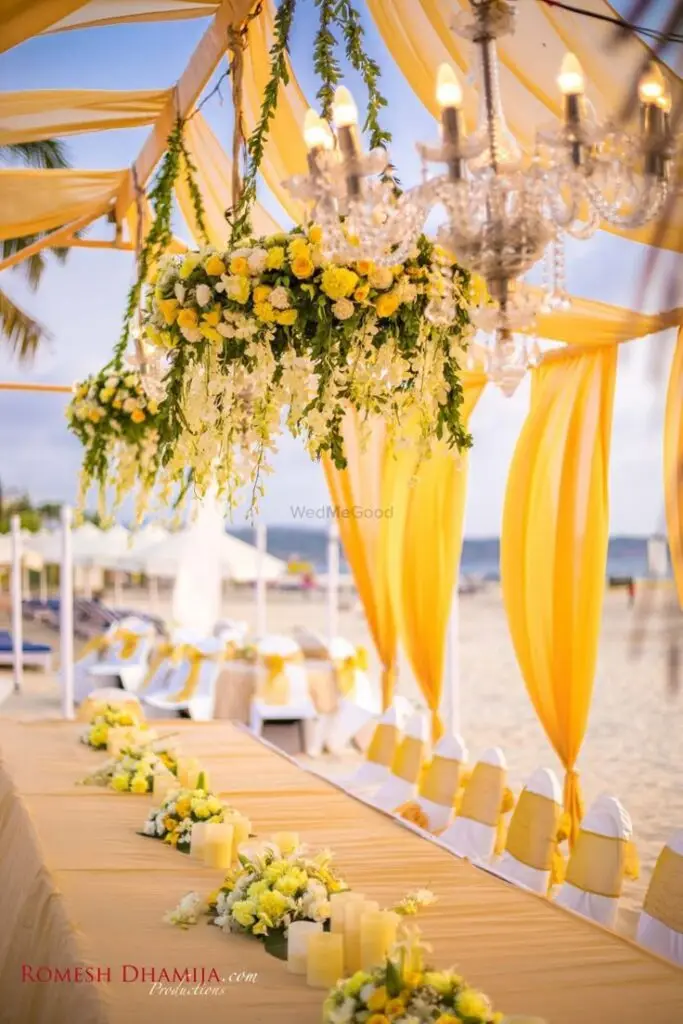
June wedding colors often incorporate sunny yellows and vibrant blues to celebrate the peak of summer brightness. These combinations create a lively, joyful atmosphere perfect for outdoor celebrations.
Beach-themed weddings benefit from aqua and sand tones, while garden parties might lean toward floral-inspired colors like rose and periwinkle. The long daylight hours complement bold choices that might feel overwhelming in other seasons.
Fall Wedding Colors: Earthy and Warm Shades
Fall weddings invite rich, cozy color schemes that mirror the changing landscape. The natural beauty of autumn provides endless inspiration for your wedding palette.
Fall Wedding Favorites:
- Burnt orange and navy
- Burgundy and gold
- Forest green and copper
- Plum and sage
Incorporating burnt orange creates an authentic autumn feel, especially when paired with deeper tones like maroon or navy. These combinations evoke the warmth and intimacy of the season.
You can enhance your fall color scheme with seasonal elements like pumpkins, wheat stalks, or maple leaves as decorative accents. Many couples embrace the earthy quality of fall with wooden details and candlelight to complement their chosen palette.
Winter Wedding Colors: Cool Tones and Festive Accents
Winter weddings sparkle with elegant, crisp color combinations that capture the magic of the season. Your winter celebration can feel luxurious and intimate with the right color selections.
Winter Palette Inspiration:
- Silver and ice blue
- Emerald and gold
- Burgundy and champagne
- Navy and blush
December wedding colors often incorporate festive elements like deep reds and evergreen, creating a holiday-inspired atmosphere without being too literal. The contrast of dark tones with metallics adds sophistication.
White-based palettes with crystal accents create a winter wonderland feel, while deeper colors add warmth to counterbalance the colder weather. Consider velvet textures in your chosen colors to add richness and comfort to your winter wedding ambiance.
Color Themes and Wedding Elements
Your color palette isn’t just about picking pretty hues—it influences nearly every visual aspect of your special day. A cohesive color scheme ties together floral arrangements, attire, and decorative elements to create a harmonious and memorable atmosphere.
Coordinating Flowers with Your Wedding Palette
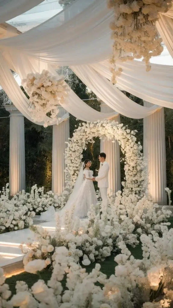
Flowers are one of the most impactful ways to showcase your wedding colors. When selecting blooms, consider what’s in season during your wedding month to ensure freshness and affordability. For a timeless look, ivory flowers work beautifully in any palette and create an elegant foundation.
Don’t forget about greenery! Adding eucalyptus, ferns, or olive branches brings texture and a natural element to arrangements while serving as a neutral that complements any color scheme. For spring weddings, mix pastel blooms with lush greenery for a garden-inspired look.
If you’ve chosen muted tones like dusty blue or sage, ask your florist to incorporate blooms in varying shades of your colors for dimension. Remember that flower ribbons and wraps are also opportunities to reinforce your palette.
Choosing Bridesmaid Dresses to Complement Your Theme
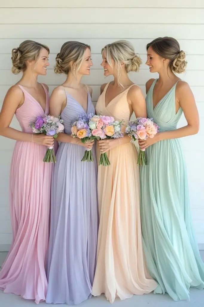
Bridesmaid dresses are moving blocks of color that will appear in countless photos, so their hues should harmonize with your overall scheme. Consider the season and venue when selecting shades—jewel tones for fall/winter, lighter palettes for spring/summer.
Mix-and-match options have become increasingly popular, allowing you to incorporate several shades from your palette. You might choose one color in different styles or several complementary colors in the same style.
Fabric choice affects how colors appear—chiffon gives an airy, lighter look to colors, while velvet and satin create rich, deeper tones. Don’t forget to bring fabric swatches to floral appointments to ensure perfect matching.
When selecting accessories, consider metallic elements (gold, silver, rose gold) as neutrals that can enhance your color story.
Table Settings and Decor That Enhance Your Colors
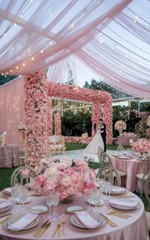
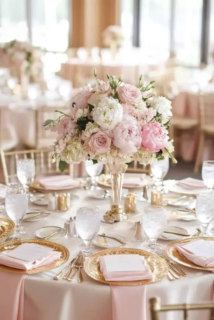
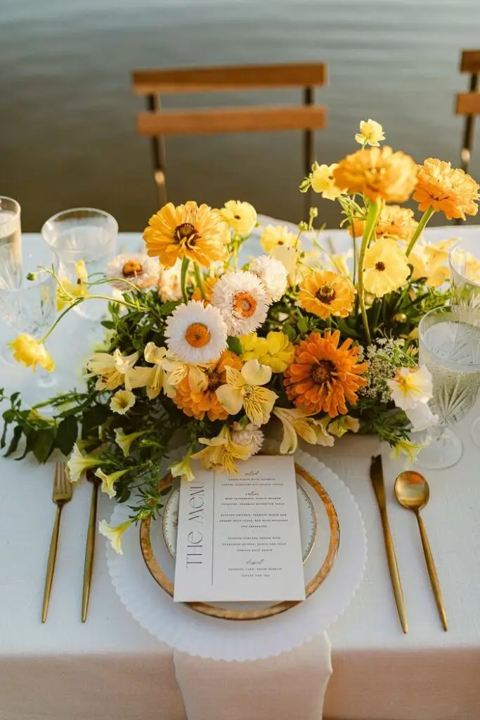
Your reception tables offer a canvas to bring your color scheme to life through linens, centerpieces, place settings, and candles. Start with table linens as your base—white or ivory tablecloths create a clean backdrop, while colored or patterned linens make a bolder statement.
Layer in chargers, plates, and napkins in complementary colors. Even small details like menu cards and place cards can reinforce your palette.
Lighting dramatically affects how colors appear in your venue. Warm amber lighting enhances reds and golds, while cooler lighting complements blues and purples.
Consider incorporating muted tones through glassware—blush water goblets or smoky tumblers add subtle color without overwhelming the table. Candle holders, table numbers, and even the cake stand are opportunities to incorporate metallic accents that elevate your color scheme.

Unique and Trendy Color Combinations
Selecting the perfect color palette can transform your wedding into a personalized celebration that reflects your style and personality. Today’s couples are exploring both timeless classics and bold new combinations to create memorable events.
Classic Pairings: Timeless and Chic
Navy blue and ivory remains one of the most elegant combinations for weddings across all seasons. This sophisticated pairing creates a clean, crisp aesthetic that works beautifully for formal celebrations.
Burgundy and gold offer rich, regal vibes that shine particularly well in fall and winter weddings. The depth of burgundy against metallic gold accents creates a luxurious atmosphere that photographs beautifully.
Black and white never goes out of style, but you can modernize this classic duo by adding a pop of color like emerald green or blush pink for dimension.
For spring ceremonies, consider blush and gray—a soft, romantic combination that feels both contemporary and timeless. Add copper accents for a subtle metallic touch that elevates the overall design.
Modern Mixes: Edgy and Unexpected Combinations
Dusty blue and copper create a striking contrast that feels both current and sophisticated. This unexpected pairing works wonderfully for industrial-chic venues or modern celebrations.
Tiffany blue and chocolate brown offer a bold statement that balances vibrant energy with grounding neutrals. You might incorporate this in your bridesmaid dresses with brown accessories or in your table settings.
Dark purple and sage green provide a moody yet natural palette that’s gaining popularity. This combination works beautifully for garden weddings or vineyard settings where you want colors to complement the surroundings.
For summer celebrations, try orange and navy—a surprisingly versatile combination that balances warm and cool tones for visual interest and energy.
Rustic Romance: Nature-Inspired Palettes
Sage green and creams create a gentle, organic feeling perfect for outdoor or barn weddings. This earthy combination evokes natural elegance without feeling overly themed.
Dusty rose paired with dark green offers a beautiful balance of soft femininity and rich natural tones. Consider incorporating plenty of greenery with subtle rose-colored blooms throughout your decor.
Sunflower-inspired palettes featuring vibrant yellows with navy or dark green backgrounds capture cheerful countryside charm. This works especially well for late summer or early fall celebrations.
For winter weddings with rustic elements, try white, green, and brown with red accents. This combination feels festive yet natural, particularly when incorporating wooden elements, evergreen branches, and berries.


