Colors influence your emotions and behaviors more than you realize. The color choices you make in your home, wardrobe, or business can trigger specific psychological responses that affect how you feel and how others perceive you.
Understanding how different colors impact human psychology allows you to create environments and designs that evoke the exact emotions and responses you want to achieve. Warm colors like red and yellow can energize and excite, while cool tones such as blue and green promote relaxation and trust. This knowledge becomes powerful when applied strategically.
Your color palette decisions shape first impressions and ongoing experiences. Whether you’re decorating a room, choosing an outfit, or developing a brand identity, the psychology behind your color choices can determine success or failure in achieving your goals.
Key Takeaways
- Colors directly influence human emotions and behaviors through psychological responses
- Cultural context and personal associations affect how people interpret different colors
- Strategic color selection requires understanding your audience and desired emotional outcome
Understanding the Psychology of Color
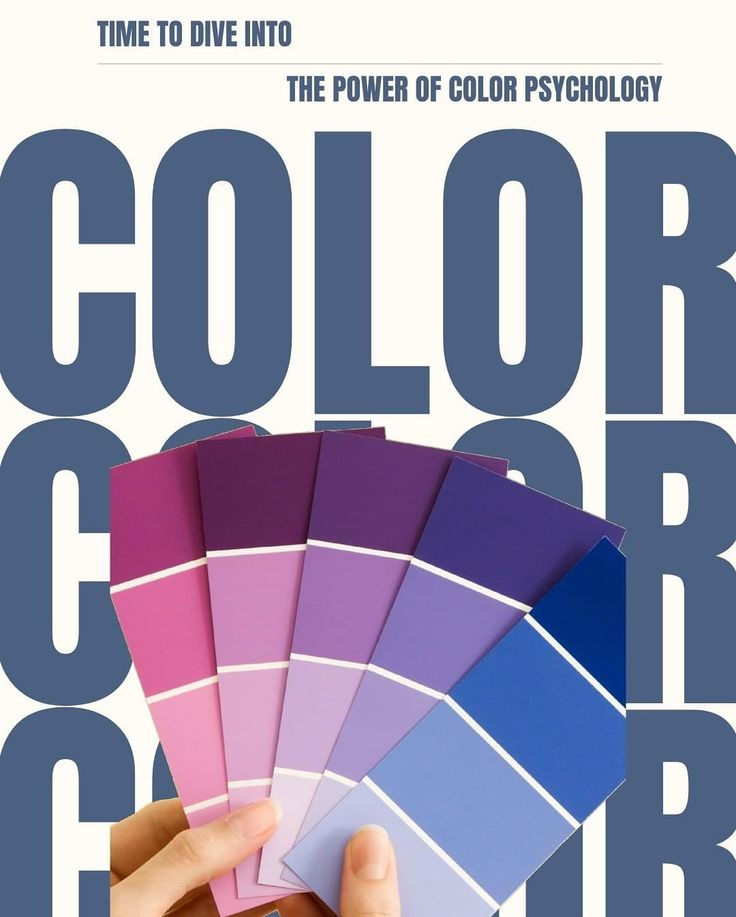
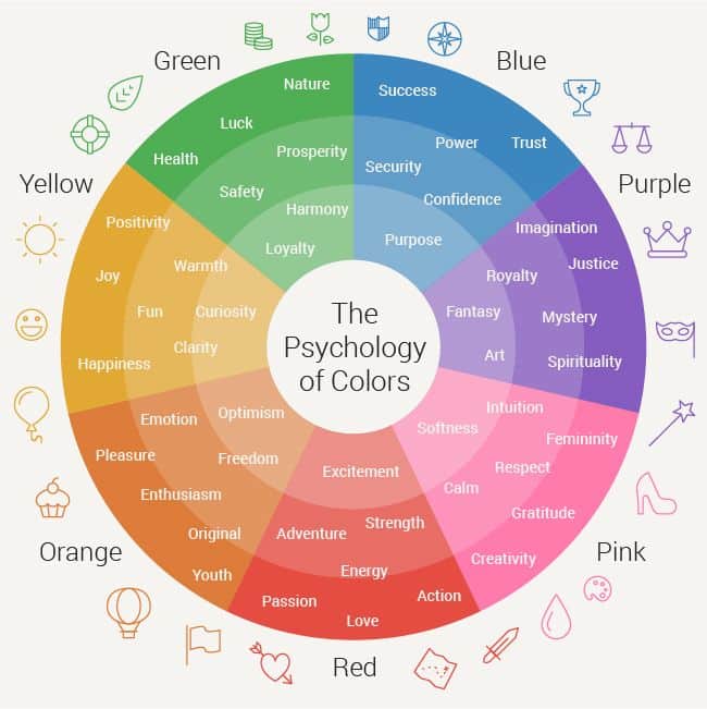
Color psychology examines how different hues affect your emotions, decision-making, and behavior patterns. Your brain processes color information instantly, triggering both conscious and subconscious responses that shape your perceptions and experiences.
How Colors Influence Mood and Behavior
Your brain responds to colors within milliseconds of visual contact. Warm colors like red and orange increase your heart rate and create feelings of energy or excitement.
Cool colors such as blue and green have the opposite effect. They lower your blood pressure and promote feelings of calm and relaxation.
Red can make you feel more alert and hungry, which explains why many restaurants use it in their branding. Yellow stimulates mental activity and can improve your focus and memory retention.
Green reduces eye strain and creates a sense of balance. Blue promotes trust and reliability, making it popular in corporate settings.
Purple combines the energy of red with the stability of blue. It often triggers feelings of creativity and luxury in viewers.
Your behavioral responses to color happen automatically. Studies show you make snap judgments about products within 90 seconds, with color influencing up to 90% of that assessment.
Color Perception and Emotional Response
Your color perception involves both biological and psychological processes. Your eyes contain specialized cells called cones that detect different wavelengths of light.
Your brain then interprets these signals and connects them to memories and emotions. This creates your personal color associations and emotional responses.
Saturation levels affect your emotional intensity. Bright, saturated colors create stronger emotional reactions than muted tones.
Context matters significantly in color perception. The same blue appears different when surrounded by warm versus cool colors.
Your lighting conditions change how you perceive colors throughout the day. Natural sunlight reveals true colors, while artificial lighting can shift your perception dramatically.
Individual experiences shape your color responses. A color linked to positive childhood memories will likely trigger pleasant emotions for you as an adult.
Color Preferences Across Demographics
Your age influences your color preferences in predictable patterns. Children typically prefer bright, saturated colors like red and yellow.
Young adults often gravitate toward trendy colors that reflect their identity and social groups. Older adults generally prefer more subdued, sophisticated color palettes.
Gender differences exist in color preferences, though they’re often culturally influenced. Research shows women typically distinguish between more color variations than men.
Cultural background significantly impacts your color associations. White represents purity in Western cultures but mourning in some Eastern traditions.
| Demographic | Common Preferences |
|---|---|
| Children | Bright, primary colors |
| Young Adults | Trendy, bold combinations |
| Older Adults | Muted, classic tones |
Your socioeconomic background also affects color choices. Higher-income groups often prefer neutral and sophisticated color schemes in their living spaces.
The Emotional Impact of Colors

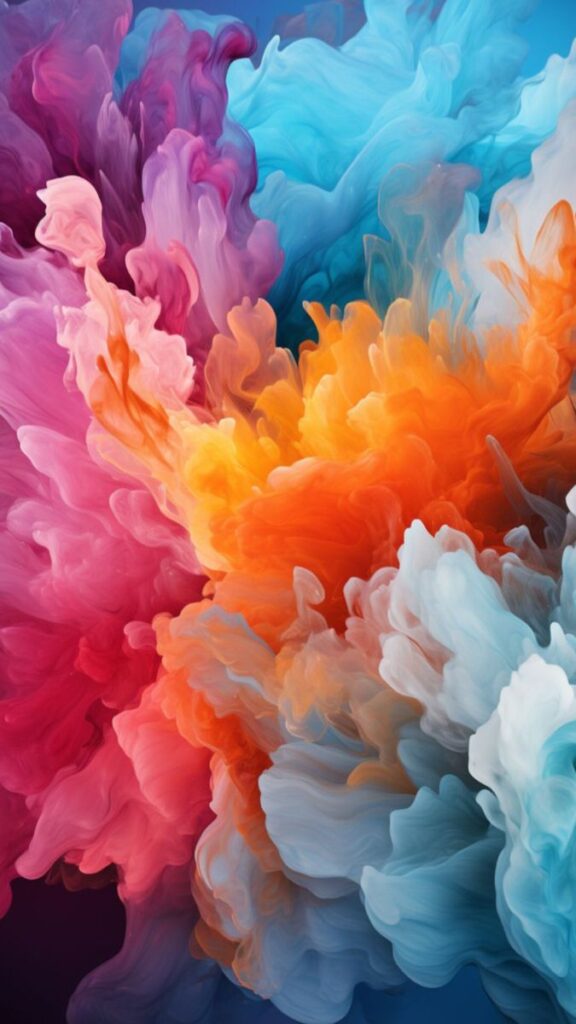
Colors directly influence your emotional state and shape how you perceive spaces and experiences. Warm tones energize and stimulate, while cool hues promote relaxation and focus, with accent and neutral colors providing balance and emphasis.
Warm Colors and Their Effects
Warm colors like red, orange, and yellow create immediate emotional responses that boost energy and excitement. These hues naturally draw attention and can make spaces feel more intimate and welcoming.
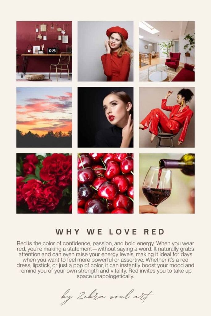
Red triggers the strongest emotional reactions. It increases heart rate and creates feelings of passion, urgency, and power. You’ll often see red used in restaurants to stimulate appetite and in retail to encourage quick purchasing decisions.
Orange combines red’s energy with yellow’s cheerfulness. This color promotes enthusiasm, creativity, and social interaction. It works well in spaces where you want to encourage conversation and activity.
Yellow stimulates mental clarity and optimism. It enhances focus and can lift your mood, making it effective in workspaces and kitchens. However, too much yellow can cause anxiety or overstimulation.
These warm tones work best when balanced with cooler colors to prevent overwhelming effects.
Cool Colors and Their Soothing Qualities
Cool colors including blue, green, and purple naturally calm your nervous system and promote relaxation. These hues reduce stress and create peaceful environments that support concentration and rest.
Blue lowers blood pressure and heart rate while promoting trust and reliability. Light blues create openness and tranquility, while darker blues convey professionalism and stability. You’ll find blue particularly effective in bedrooms and offices.
Green connects you with nature and promotes balance and harmony. It reduces eye strain and creates feelings of growth and renewal. Green works well in any space where you want to feel refreshed and centered.
Purple combines blue’s calming effects with red’s energy. Lighter purples like lavender promote serenity, while deeper purples suggest luxury and creativity. This color supports meditation and introspective activities.
Cool colors expand spaces visually and create backgrounds that don’t compete for attention.
The Power of Accent and Neutral Tones
Accent colors serve as focal points that direct attention and add personality to your space. Choose accent colors that contrast with your main palette to create visual interest without overwhelming the room.
Bold accent colors like bright red, electric blue, or vibrant yellow energize specific areas. Use them sparingly on single walls, artwork, or accessories to create impact without causing fatigue.
Neutral tones including white, gray, beige, and brown provide stability and versatility. These colors don’t trigger strong emotional responses, making them perfect foundations for your color scheme.
White creates cleanliness and spaciousness but can feel cold without warmer accents. Gray offers sophistication and works with any accent color. Beige and brown add warmth while maintaining neutrality.
Neutrals allow you to change accent colors easily without repainting entire rooms. They also prevent color fatigue that can occur with too many bold choices.
Cultural and Social Significance of Colors
Colors carry vastly different meanings across cultures, with the same hue evoking opposite emotions or associations depending on your cultural background. These cultural color meanings shape everything from branding decisions to social interactions in modern society.
Global Differences in Color Meanings
Red demonstrates striking cultural variations in meaning. In China, you’ll find red symbolizes luck, prosperity, and celebration at weddings. However, in South Africa, red represents mourning and loss.
White creates equally diverse associations worldwide. Western cultures connect white with purity and wedding ceremonies. In contrast, many Asian cultures view white as the color of death and mourning.
Black carries different weight depending on your location. Western societies often link black to elegance and formality. Some African cultures see black as masculinity and maturity.
| Color | Western Meaning | Eastern/Other Meanings |
|---|---|---|
| Red | Danger, passion | Luck, prosperity (China) |
| White | Purity, weddings | Death, mourning (Asia) |
| Yellow | Happiness, caution | Sacred, imperial (China) |
| Green | Nature, growth | Prosperity (Islam), jealousy |
Purple shows economic cultural significance. European history linked purple to royalty due to expensive dye costs. Many cultures still associate purple with wealth and status today.
Color Symbolism in Modern Society
Brand identity relies heavily on cultural color meanings. McDonald’s uses red and yellow globally because these colors stimulate appetite and energy across most cultures. Coca-Cola’s red builds on associations with excitement and passion.
Social movements adopt specific colors for recognition. Environmental groups choose green for nature connections. Political parties select colors that resonate with their target audiences’ cultural backgrounds.
Digital communication creates new color meanings. Blue dominates social media platforms because it suggests trust and reliability. Tech companies favor blue, white, and gray for professional credibility.
Religious significance continues influencing color choices. Islamic cultures embrace green for its spiritual connections. Christian traditions use purple during Lent and gold for celebration.
Economic sectors develop color conventions. Healthcare uses white and blue for cleanliness and trust. Financial institutions choose blue and green for stability and growth associations.
Practical Steps for Choosing a Color Palette
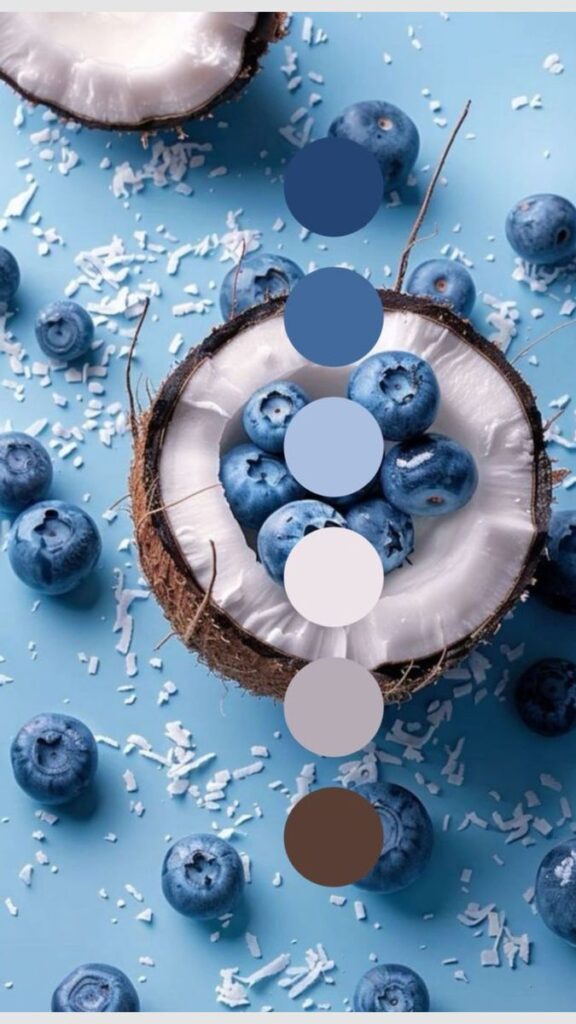
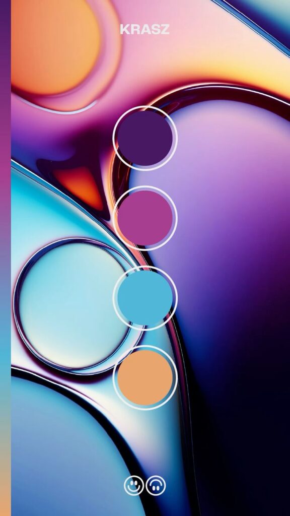
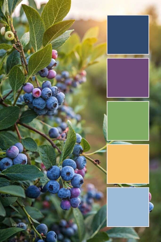
Creating an effective color palette requires understanding your project’s goals, evaluating how colors work together, and testing your choices before final implementation. These three essential steps ensure your palette supports both aesthetic appeal and functional success.
Defining Project Purpose and Audience
Start by identifying what you want your color palette to accomplish. Different projects require different emotional responses and psychological impacts.
Consider your target audience’s demographics and preferences. Age groups respond differently to colors, with younger audiences often preferring bold, vibrant choices while older demographics may favor muted tones.
Define the mood you want to create. Corporate branding typically benefits from trustworthy blues and professional grays. Creative projects might embrace energetic oranges or innovative purples.
Think about cultural associations your audience holds. Red symbolizes luck in Chinese culture but can signal danger in Western contexts.
Document your project’s functional requirements. Web interfaces need sufficient contrast for accessibility. Print materials must account for color reproduction limitations.
Your project’s environment also matters. Interior spaces require consideration of natural light throughout the day. Digital displays vary in color accuracy across devices.
Evaluating Color Combinations for Harmony
Test color harmony using established relationships on the color wheel. Complementary colors sit opposite each other and create high contrast and visual energy.
Analogous combinations use colors next to each other on the wheel. These create peaceful, cohesive feels perfect for calming environments.
Try triadic schemes using three evenly spaced colors. This approach offers vibrant contrast while maintaining color harmony throughout your design.
Consider the 60-30-10 rule for balanced distribution. Use your dominant color for 60% of the design, secondary for 30%, and accent colors for 10%.
Contrasting colors help establish hierarchy and draw attention to important elements. Balance high contrast areas with neutral spaces to prevent visual fatigue.
Test warm and cool combinations carefully. Warm colors advance visually while cool colors recede, affecting spatial perception.
Evaluate your color combinations in different lighting conditions. Colors shift appearance under various light sources, potentially disrupting your intended harmony.
Testing and Refining Your Palette Choices
Create mockups using your chosen color palette in realistic contexts. Apply colors to actual design elements rather than viewing them in isolation.
Test accessibility standards for digital projects. Ensure sufficient contrast ratios between text and backgrounds meet WCAG guidelines.
Gather feedback from representative users or stakeholders. Fresh perspectives often reveal issues you might overlook after extended exposure to your palette.
Print test samples if your project involves physical materials. Screen colors rarely match printed results exactly.
View your palette under different lighting conditions. Fluorescent, LED, and natural light can dramatically alter color appearance.
Make incremental adjustments based on testing results. Small shifts in saturation or brightness often resolve harmony issues without requiring complete palette changes.
Document your final choices with specific color codes. This ensures consistent reproduction across different applications and team members.
The Role of Color Psychology in Design and Branding
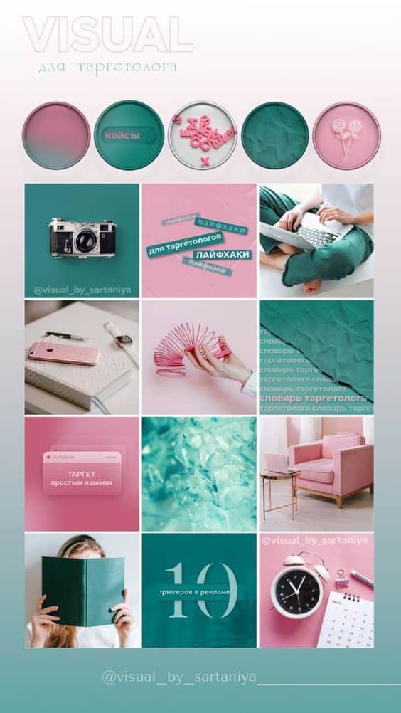
Color psychology shapes how consumers perceive brands and influences their emotional responses to visual content. Strategic color choices build brand recognition while following current trends helps maintain relevance in competitive markets.
Establishing Brand Identity Through Color
Your color palette serves as a visual shorthand for your brand’s personality and values. When customers see your colors, they should immediately connect them to your business.
Brand recognition increases by up to 80% when consistent colors are used across all touchpoints. This consistency helps customers identify your products on crowded shelves or recognize your ads in busy social media feeds.
Different industries favor specific color schemes for good reason:
- Technology companies often choose blue for trust and reliability
- Food brands use red and yellow to stimulate appetite
- Luxury brands prefer black, gold, or deep purples for sophistication
- Eco-friendly companies select green to emphasize sustainability
Your target audience’s cultural background affects color interpretation. Red symbolizes luck in China but danger in Western cultures. Consider these differences when expanding globally.
Creating Memorable User Experiences
Colors directly impact how users interact with your website, app, or physical products. The right palette guides attention and creates emotional connections.
Warm colors like orange and red create urgency and excitement. Use these for call-to-action buttons or limited-time offers. Cool colors like blue and green promote calm and trust, making them ideal for financial services or healthcare brands.
Color contrast affects readability and accessibility. Ensure sufficient contrast between text and background colors to meet accessibility standards. Poor contrast frustrates users and can exclude people with visual impairments.
Emotional responses to color combinations influence purchasing decisions. Complementary colors create visual interest, while analogous colors feel harmonious and peaceful.
Color Trends and Their Influence
Color trends evolve regularly, influenced by fashion, technology, and cultural shifts. Staying current helps your brand feel modern and relevant.
Recent trends include:
| Trend | Description | Best For |
|---|---|---|
| Living Coral | Warm, energetic pink-orange | Lifestyle brands, beauty |
| Digital Lime | Bright, tech-inspired green | Apps, gaming, youth brands |
| Classic Blue | Calming, dependable navy | Corporate, professional services |
Monitor trend forecasts from Pantone, design publications, and industry reports. However, don’t chase every trend blindly.
Your brand colors should balance trendy elements with timeless appeal. Consider updating accent colors seasonally while keeping core brand colors consistent. This approach keeps your identity fresh without confusing customers.
Social media platforms often drive color adoption. Instagram’s gradient logo sparked widespread use of colorful gradients in app design and digital marketing.


