Choosing the perfect color palette for your wedding or event can feel overwhelming with endless possibilities and combinations to consider. Your color choices will set the mood for your entire celebration and tie together every element from flowers to linens to stationery.
A well-designed wedding palette should include three to five main colors that create a cohesive look without overwhelming your guests. This balanced approach allows you to express your personal style while ensuring all your decorative elements work harmoniously together. The colors you select should reflect your personality and complement your venue’s existing features.
Your wedding palette becomes the foundation for all your design decisions, from invitations to centerpieces to bridesmaid dresses. Understanding how to select and apply the right colors will transform your vision into a stunning reality that feels authentically you.
Key Takeaways
- Wedding color palettes work best with three to five coordinating colors that create visual harmony
- Your color choices should reflect your personal style while complementing your venue and season
- A thoughtfully chosen palette serves as the foundation for all wedding design elements and decor decisions
Understanding Color Palette Fundamentals
A successful wedding or event color palette relies on understanding basic color principles and how different hues work together. The color wheel serves as your foundation for creating harmonious combinations that enhance your celebration’s overall aesthetic.
Defining Color Palettes for Weddings and Events
Your color palette is the complete collection of colors that will appear throughout your wedding or event. This includes everything from invitations and linens to flowers and décor.
A well-planned palette typically contains 3-5 colors. You’ll have one primary color as your main focus, 1-2 secondary colors for support, and neutral accents like cream, gray, or white.
Wedding palettes differ from regular design palettes because they must work across diverse elements. Your colors need to look good on fabric, paper, flowers, and lighting simultaneously.
Consider how your palette will translate to different materials. A burgundy that looks rich on velvet might appear different on satin or in fresh flowers.
Essential palette components:
- Primary color: Your main wedding color (40-50% of palette)
- Secondary colors: Supporting hues (30-40% of palette)
- Accent colors: Small pops of contrast (10-20% of palette)
- Neutrals: Foundation colors like white, cream, or gray
Color Theory Essentials: Hue, Tone, Shade, and Tint
Understanding color terminology helps you communicate your vision clearly to vendors and create sophisticated combinations.
Hue refers to the pure color itself – red, blue, yellow, or green. This is what most people simply call “color.”
Shade is created by adding black to a hue. Navy is a shade of blue, while burgundy is a shade of red.
Tint results from adding white to a hue. Pink is a tint of red, and powder blue is a tint of blue.
Tone happens when you add gray to a hue. This creates more muted, sophisticated versions of bright colors.
These variations let you create depth within your palette. Instead of using just “blue,” you might combine navy (shade), powder blue (tint), and dusty blue (tone) for a layered look.
Mixing shades, tints, and tones of the same hue creates monochromatic elegance. Combining different hues with similar tones produces harmony across color families.
How the Color Wheel Influences Palette Choices
The color wheel contains primary colors (red, blue, yellow), secondary colors (orange, green, purple), and tertiary colors that blend these together.
Complementary colors sit opposite each other on the wheel. Think red and green, or blue and orange. These create vibrant, high-contrast combinations.
Analogous colors are neighbors on the wheel. Blue, blue-green, and green work harmoniously together because they share common undertones.
Triadic schemes use three colors equally spaced on the wheel. Red, yellow, and blue create a classic, balanced palette when used in different intensities.
For weddings, analogous and monochromatic schemes often work best. They create sophisticated, cohesive looks that photograph beautifully.
Popular wheel-based combinations:
- Split-complementary: One main color plus two colors adjacent to its complement
- Tetradic: Four colors forming a rectangle on the wheel
- Monochromatic: Various shades, tints, and tones of one hue
Use the 60-30-10 rule when applying your wheel-based palette. Sixty percent dominant color, thirty percent secondary, and ten percent accent create visual balance.
Deciding on Your Perfect Wedding Color Scheme
Your wedding color palette sets the foundation for every design decision throughout your wedding planning process. The scheme you select should balance your personal preferences with practical considerations like venue characteristics and the emotional atmosphere you want to create.
Reflecting Your Personal Style and Theme
Your wedding color scheme should mirror who you are as a couple. Start by examining the colors that naturally appear in your shared spaces, wardrobes, and favorite belongings.
Consider your lifestyle and personalities. Are you drawn to minimalist aesthetics with neutral tones, or do bold, vibrant hues energize you? Your everyday preferences offer the best starting point for your wedding color palette.
Think about meaningful colors from your relationship. Perhaps you met at a lavender farm or got engaged during a sunset with coral and gold hues. These personal connections create authentic color stories for your celebration.
Popular Style Approaches:
- Classic Elegant: Ivory, champagne, gold accents
- Modern Minimalist: White, gray, single bold accent color
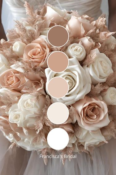
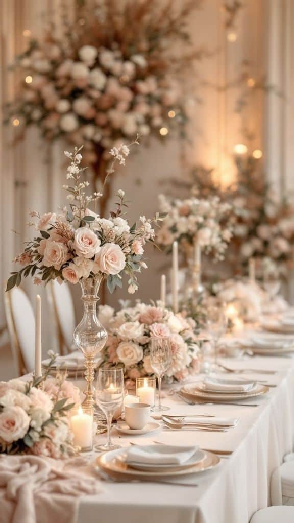
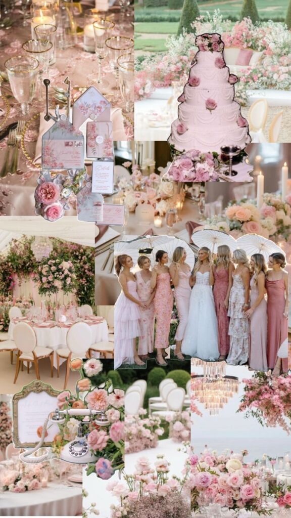
- Romantic Garden: Blush pink, sage green, cream
- Bohemian: Terracotta, dusty blue, burgundy
Your chosen theme directly influences color selection. A beach wedding naturally accommodates ocean blues and sandy neutrals, while a vintage celebration might feature dusty rose and antique gold tones.
Considering the Venue and Setting
Your venue acts as the backdrop for your entire wedding color palette. Indoor spaces with existing decor require colors that complement rather than clash with permanent fixtures.
Examine your venue’s architectural elements, lighting, and built-in color scheme. A rustic barn with warm wood tones pairs beautifully with earthy colors, while a modern ballroom with cool lighting accommodates jewel tones effectively.
Venue-Color Matching Tips:
- Take photos of your venue in different lighting conditions
- Request color samples from existing linens or decor
- Ask about lighting options that enhance your chosen palette
- Consider how your colors photograph in the space
Seasonal timing affects both venue appearance and color appropriateness. Spring venues often have blooming flowers that should coordinate with your palette. Winter celebrations in ballrooms can handle deeper, richer tones that might feel heavy in summer garden settings.
Outdoor venues require weather considerations. Your wedding color scheme needs to work with natural lighting changes and potential backup indoor spaces.
Incorporating Color Psychology and Ambiance
Colors directly influence the emotional atmosphere of your celebration. Understanding color psychology helps you create the exact mood you envision for your wedding day.
Warm colors like reds, oranges, and yellows create energetic, passionate feelings. These work well for couples wanting lively, celebratory atmospheres with dancing and festivities.
Cool colors including blues, greens, and purples promote calm, serene environments. These choices suit couples preferring intimate, peaceful celebrations focused on connection and conversation.
Color Mood Guide:
- Red: Passion, energy, drama
- Blue: Trust, stability, calm
- Green: Growth, harmony, nature
- Purple: Luxury, creativity, mystery
- Pink: Romance, tenderness, joy
- Yellow: Happiness, optimism, warmth
Your accent color provides opportunities to add personality without overwhelming your primary palette. Choose one vibrant accent that appears in small doses through flowers, ribbons, or table details.
Neutral base colors allow your accent color to shine while providing visual rest. Ivory, champagne, sage, or gray create sophisticated foundations that photograph beautifully and age well in wedding albums.
Consider how your wedding color palette will appear in various lighting throughout your celebration. Candlelight, natural sunlight, and reception lighting all affect color appearance and overall ambiance.
Popular and Timeless Color Combinations
Certain color combinations have proven their staying power across decades of weddings and events. These palettes range from traditional navy and gold pairings to contemporary terracotta and sage green combinations that feel fresh yet enduring.
Classic Hues: Navy Blue, Gold, and Blush
Navy blue serves as one of the most versatile foundation colors for wedding palettes. You can pair it with gold accents for a sophisticated look that works in any season.
The navy and gold combination creates elegant contrast without being overwhelming. Use navy for bridesmaid dresses and gold for table settings or invitation accents.
Adding blush pink to navy creates a softer, romantic feel. This three-color palette works beautifully for both indoor and outdoor celebrations.
Key applications:
- Navy linens with gold charger plates
- Blush florals against navy backdrops
- Gold calligraphy on navy invitations
- Mixed bridesmaid dresses in navy and blush
These complementary colors photograph well and create cohesive styling across all wedding elements from ceremony to reception.
Modern Pairings: Terracotta and Sage Green
Terracotta and sage green represent a growing trend in contemporary wedding color schemes. These earthy tones create warmth while maintaining sophistication.
Terracotta adds richness without being too bold. Sage green provides a calming balance that feels natural and organic.
This pairing works especially well for outdoor venues or rustic settings. The colors complement natural wood elements and greenery beautifully.
You can incorporate these hues through:
- Terracotta bridesmaid dresses with sage bouquet ribbons
- Mixed centerpieces featuring both colors
- Sage green table runners with terracotta napkins
- Two-toned wedding stationery
The combination photographs beautifully in natural light and creates an effortlessly elegant atmosphere.
Elegant Contrasts: Icy Blue and Deep Tones
Icy blue paired with deeper tones creates striking visual interest. This combination offers sophistication through contrast rather than harmony.
Pair icy blue with charcoal gray or deep burgundy for dramatic effect. The light blue softens darker colors while the deep tones ground the palette.
This approach works well for winter weddings or evening celebrations. The contrast creates depth in your decor and photography.
Consider these applications:
- Icy blue linens with charcoal napkins
- Deep burgundy florals with pale blue accents
- Mixed bridesmaids in coordinating dark and light shades
Unique Color Combinations for Standout Events
Move beyond traditional palettes with unexpected yet harmonious combinations. Lavender and champagne gold create romantic elegance with a twist.
Dusty rose paired with eucalyptus green offers softness with natural appeal. These unique color combinations help your event feel personal and memorable.
Consider coral and navy for coastal celebrations or mauve and copper for autumn events. Test unusual pairings by viewing fabric swatches together in your venue’s lighting.
Bold options to consider:
- Emerald green with blush pink
- Burnt orange with cream
- Deep plum with soft gray
- Mustard yellow with sage
These distinctive palettes ensure your celebration stands apart while maintaining visual cohesion.
Seasonal Inspiration for Event Palettes
Each season brings distinct color characteristics that can perfectly match your wedding’s natural timing. Spring favors soft pastels and fresh greens, summer embraces vibrant and bold hues, fall showcases warm earth tones, and winter offers elegant cool shades with metallic accents.
Spring Wedding Colors and Trends
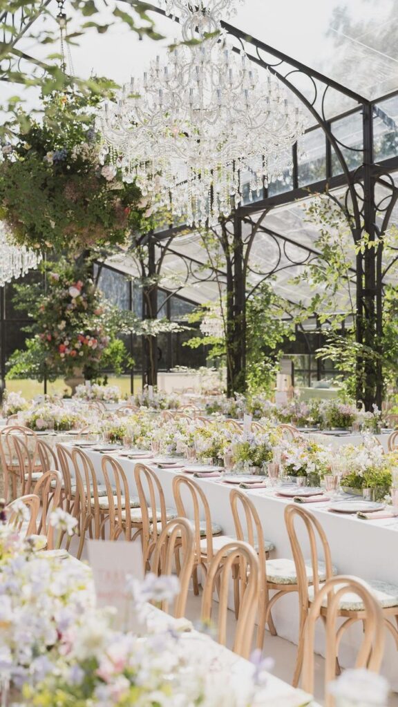
Spring wedding colors center around renewal and growth. Soft pastels like blush pink, lavender, and sage green create romantic atmospheres that mirror blooming gardens.
Popular Spring Combinations:
- Blush and ivory with gold accents
- Sage green and cream
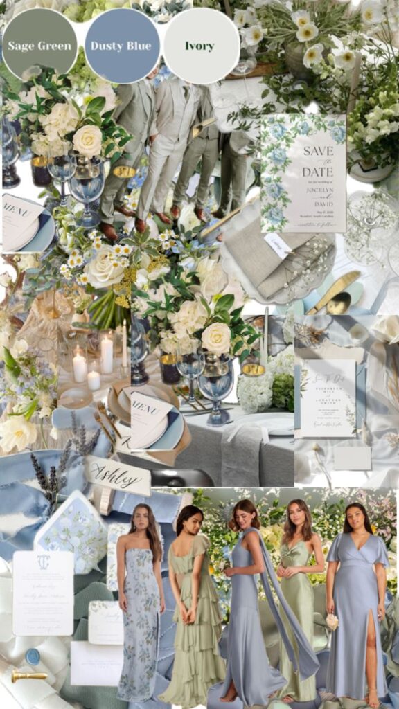
- Lavender and dusty blue
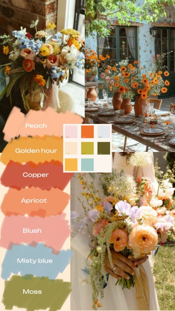
- Peach and coral tones
You can incorporate deeper accent colors like navy or burgundy to add sophistication. These darker shades prevent the palette from appearing too light or washed out.
Fresh greenery plays a crucial role in spring palettes. Eucalyptus, ferns, and flowering branches complement pastel foundations beautifully.
Consider seasonal flowers when selecting colors. Tulips, peonies, and cherry blossoms naturally guide your palette toward appropriate spring tones.
Summer Wedding Colors for a Vibrant Look
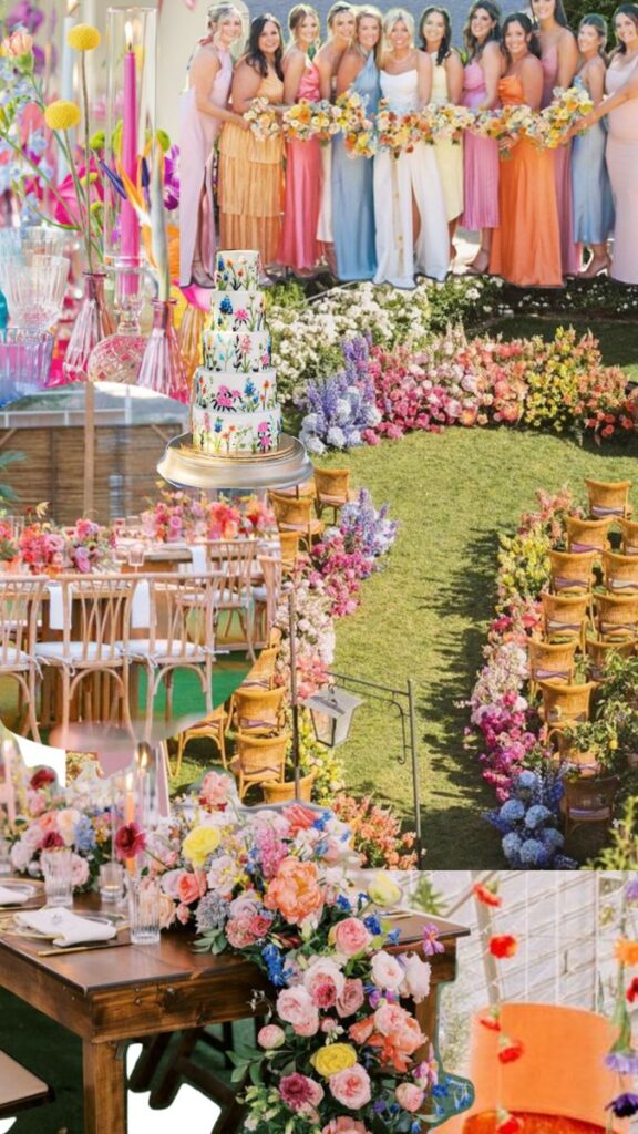
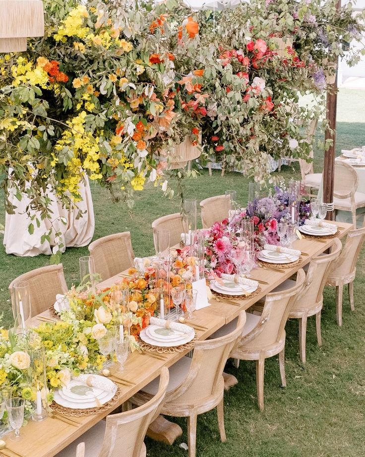
Summer wedding colors embrace energy and warmth. Bright corals, sunny yellows, and ocean blues capture the season’s lively spirit perfectly.
Bold Summer Options:
- Coral and turquoise
- Bright yellow and navy
- Fuchsia and orange
- Emerald green and gold
These vibrant combinations work especially well for outdoor ceremonies and receptions. The natural sunlight enhances bold colors and creates stunning photography opportunities.
Tropical-inspired palettes featuring hot pink, orange, and lime green suit beach or garden venues. These combinations feel fresh and celebratory during warm months.
You can balance bright colors with neutral whites or creams. This prevents the palette from becoming overwhelming while maintaining summer’s energetic feel.
Fall Wedding Colors That Warm the Celebration
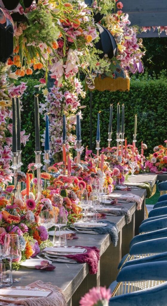
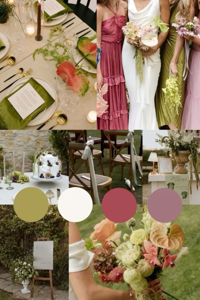
Fall wedding colors draw from nature’s autumn transformation. Rich burgundies, burnt oranges, and deep golds create cozy, intimate atmospheres.
Classic Fall Palettes:
- Burgundy and cream
- Burnt orange and navy
- Deep gold and chocolate brown
- Plum and sage green
These earthy tones complement seasonal elements like pumpkins, wheat, and changing leaves. Your venue’s natural fall decorations enhance these color choices effortlessly.
Metallic accents in copper or bronze add elegance to fall palettes. These warm metals echo autumn’s golden light and create sophisticated details.
Consider incorporating jewel tones like emerald or sapphire as accent colors. They add richness without competing with your primary autumn hues.
Winter Wedding Colors for a Magical Atmosphere
Winter wedding colors emphasize elegance and sophistication. Cool blues, silver metallics, and crisp whites create magical, frost-inspired themes.
Elegant Winter Combinations:
- Navy and silver
- Icy blue and white
- Emerald green and gold
- Burgundy and champagne
These palettes work beautifully with winter’s natural elements. Snow, evergreens, and bare branches provide stunning backdrops for these sophisticated colors.
Metallic accents in silver, gold, or rose gold add glamour to winter celebrations. They reflect candlelight and create warm, inviting atmospheres despite the cold season.
Deep jewel tones like sapphire or amethyst provide richness against winter’s stark landscapes. These colors photograph beautifully in low light conditions common during winter months.
Tips for Assembling and Applying Your Chosen Palette
Once you’ve selected your primary wedding colors, the key lies in balancing accent colors strategically and ensuring all elements work together harmoniously. Your palette should create visual flow through thoughtful layering and consistent application across every detail.
Using Accent Colors for Cohesion
Accent colors serve as the bridge between your main wedding colors and create visual interest throughout your venue. Choose one or two accent shades that complement your primary palette without overwhelming it.
Apply your accent color in small doses across multiple elements. Use it in napkin rings, candle holders, ribbon details, and small floral touches. This creates rhythm and helps guests’ eyes move naturally around the space.
Consider the 60-30-10 rule for color distribution. Your dominant color should cover 60% of the visual space, your secondary color 30%, and accent colors the remaining 10%.
Metallic accents like gold, silver, or copper can serve as neutral accent colors. They add elegance without competing with your chosen color schemes.
Test your accent colors in different lighting conditions. What looks perfect in daylight might appear different under evening reception lighting.
Harmonizing Florals and Décor Elements
Your floral arrangements should showcase your palette while maintaining visual balance across all décor elements. Work with your florist to select flowers in varying shades of your chosen colors rather than exact matches.
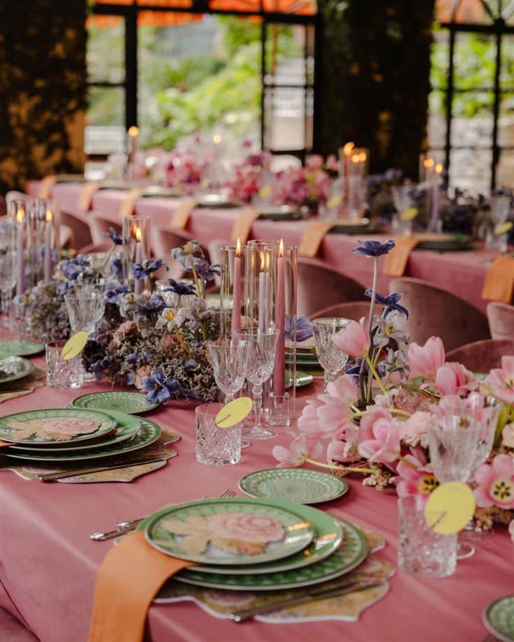
Create depth by mixing flowers in light, medium, and dark tones of the same color family. Blush, rose, and burgundy work together beautifully in romantic wedding colors.
Coordinate linens, centerpieces, and place settings using your established palette. Your tablecloths might feature your dominant color while napkins showcase your accent shade.
Don’t forget about greenery as a neutral element. It provides natural contrast and helps break up bold colors without disrupting your overall scheme.
Consider seasonal flower availability when planning. Spring pastels work naturally with cherry blossoms, while deep autumn tones pair perfectly with seasonal foliage.
Layering Shades and Textures for Depth
Texture variation prevents your palette from appearing flat or monotonous. Mix smooth satin linens with rough burlap runners or glossy ceramics with matte candlesticks.
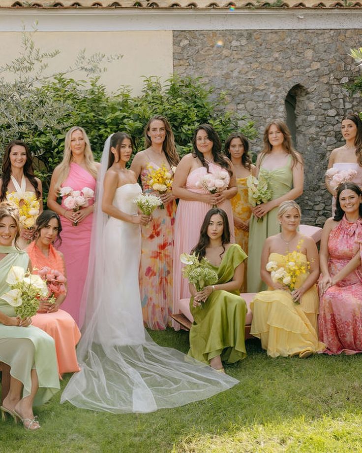
Use different shades of the same color to create visual layers. Light blue bridesmaid dresses can pair with navy groomsmen ties and dusty blue table runners.
Incorporate various materials that reflect your colors differently. Velvet absorbs light for rich, deep tones while silk reflects light for brighter appearances.
Balance warm and cool undertones within your chosen colors. A warm coral can be balanced with cooler pink shades to create sophisticated contrast.
Consider how your palette will photograph. Varied textures and shades ensure your color schemes appear dynamic and interesting in both natural and artificial lighting.


