Colors are more than just visual elements; they play a crucial role in how consumers perceive brands and make purchasing decisions. Understanding the psychological impact of colors can enhance your marketing strategy and effectively shape your brand identity. From evoking emotions to influencing customer behavior, the right color choices can markedly improve your connections with your audience.
By embracing color psychology in your marketing efforts, you can create compelling visuals that resonate with your target demographic. Selecting the appropriate color scheme not only determines the aesthetics of your brand but also communicates your values and message effectively. This article will explore essential strategies for utilizing color in your marketing initiatives.



Key Takeaways
- Color choices significantly affect customer perception and behavior.
- The right color scheme strengthens brand identity and messaging.
- Effective color implementation enhances digital marketing efforts.
Understanding Color Psychology in Marketing
Color plays a crucial role in influencing consumer behavior. By leveraging color psychology in marketing, you can evoke specific emotions and strengthen brand recognition.
The Power of Color Associations
Colors are often tied to various associations that shape consumer perception. For example, blue typically symbolizes trust and dependability, while red often evokes excitement and urgency.
- Yellow: Optimism and cheerfulness.
- Green: Growth and health.
- Black: Sophistication and elegance.
Understanding these associations helps in choosing the right colors for your brand and marketing materials. When consumers see colors that align with their expectations, they are more likely to feel positively about the product or service being offered.
Emotional Resonance of Colors
Colors can significantly influence emotions. For instance, warm colors like red and orange can create feelings of warmth and energy, while cool colors like blue and green typically promote calmness and relaxation.
This emotional resonance can dramatically affect purchase decisions. Consider how your audience might respond to different colors:
- Red: Increases heart rates, sparking excitement.
- Blue: Soothes and encourages trust.
- Yellow: Instills positivity, which can lead to impulse purchases.
Utilizing these emotional cues in design and marketing strategies can enhance consumer engagement.
Colors and Brand Recognition
Brand recognition is heavily influenced by consistent color use. Studies show that consistent branding across platforms can increase brand recognition by up to 80%.
- Logos: Many successful brands utilize a distinct color palette. For example, Coca-Cola’s red is synonymous with its identity.
- Packaging: Colors on packaging can draw attention and convey information about the product.
When consumers consistently see the same colors associated with a brand, it strengthens their memory and builds trust. This consistency is vital for creating lasting impressions and fostering loyalty in your target audience.


Choosing the Right Color Scheme
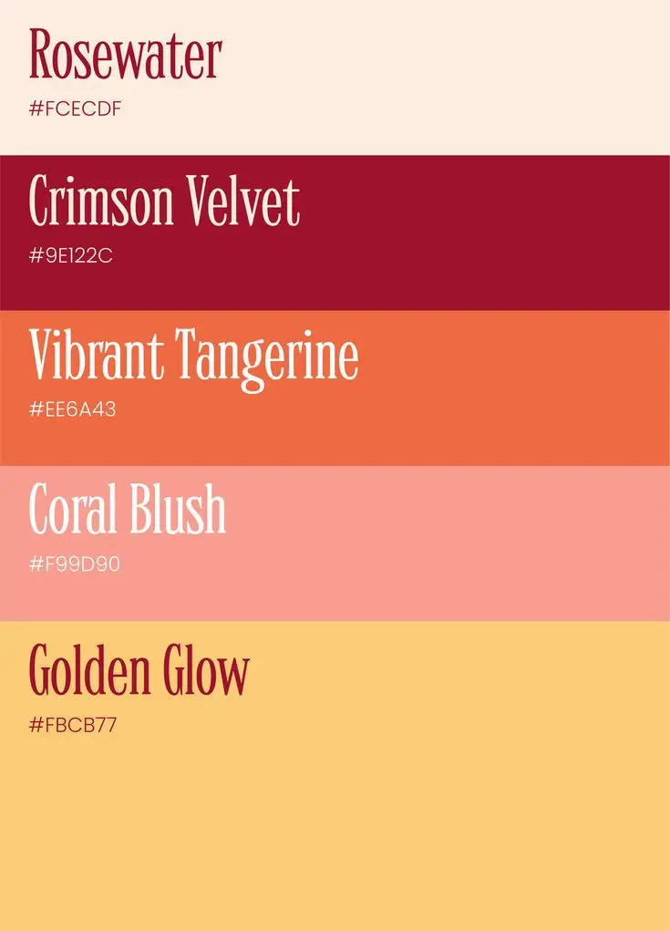
Selecting the appropriate color scheme is essential for effective marketing. By understanding your target audience, evaluating different color schemes, and utilizing color theory, you can create a cohesive and appealing visual identity for your brand.
Analyzing the Target Audience
Identifying your target audience is critical in color selection. Research their demographics, preferences, and cultural influences. Different colors evoke specific emotions and reactions. For instance, blue often conveys trust, while red can signify excitement or urgency.
Consider using surveys or focus groups to gain insights into consumer perceptions regarding color. Understanding what resonates with your audience enhances brand personality and ensures your marketing strategy aligns with their expectations. Tailoring your colors to your audience fosters a stronger connection with your brand.
Evaluating Color Schemes
Once you know your audience, evaluate different color schemes that suit your brand. Common types include monochromatic, complementary, analogous, and triadic schemes. Each has unique characteristics.
- Monochromatic: Uses variations of one color, providing a harmonious and cohesive look.
- Complementary: Pairs colors opposite each other on the color wheel, creating high contrast and visual interest.
- Analogous: Combines colors that are next to each other on the wheel, delivering a more subtle and harmonious feel.
- Triadic: Uses three evenly spaced colors on the wheel, resulting in a vibrant and dynamic palette.
Consider which scheme aligns best with your brand personality and the emotions you want to evoke.
Utilizing the Color Wheel
The color wheel is a valuable tool in color selection. It consists of primary, secondary, and tertiary colors, guiding you to create harmonious combinations. Understanding the relationships between colors can simplify your decision-making process.
For contrast, choose complementary colors to draw attention. For harmony, select analogous colors, as they work together seamlessly. Exploring triadic combinations can bring depth and excitement to your designs.
Experiment with various combinations using the color wheel to see how they work in context. Remember, contrast and harmony are crucial in making your marketing visuals not only attractive but also effective in conveying your message.


Color Strategies for Effective Branding
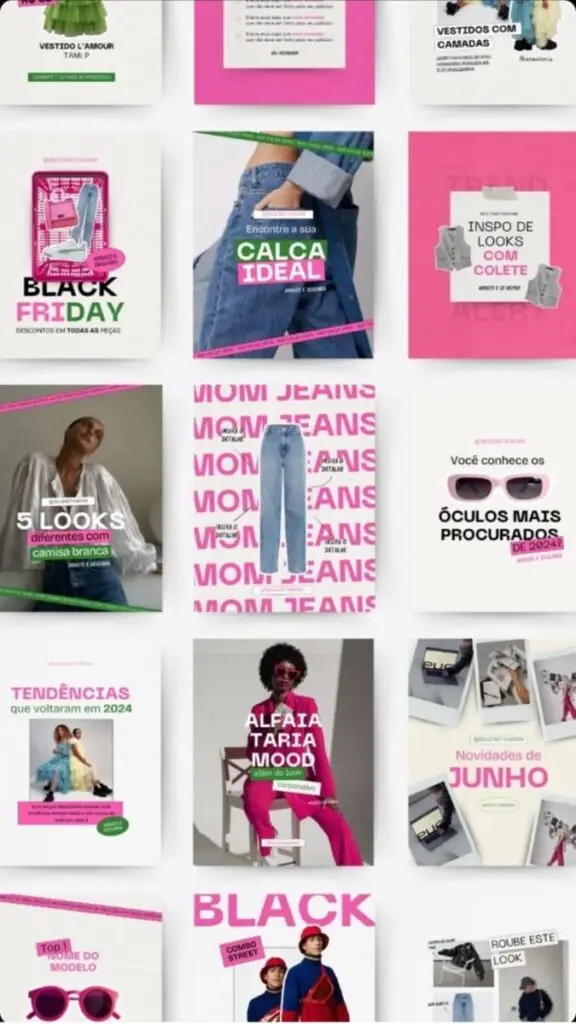
Selecting the right colors for branding is crucial. This section addresses the importance of consistency in brand image, the impact colors have on purchasing decisions, and the cultural nuances that should guide your color choices.
Consistency and Brand Image
Consistency in color use reinforces brand recognition. When you maintain a uniform color palette across all platforms, your audience quickly associates those colors with your brand.
Establishing a primary color and supporting colors can strengthen your brand identity. Tools like color palettes or style guides help maintain this consistency across marketing materials, websites, and products.
This harmonious approach builds trust and familiarity, making it easier for customers to connect with your brand. Brands like Coca-Cola effectively utilize their signature red to create an instantly recognizable image.
Impact of Color on Purchasing Decisions
Colors influence emotions and behaviors, significantly affecting purchasing decisions. For instance, warm colors like red and yellow can create a sense of urgency, often driving impulse purchases.
On the other hand, cooler colors like blue and green tend to evoke feelings of calm and trust. Brands that choose these colors can foster loyalty among consumers.
A study found that nearly 85% of consumers make decisions based on color alone. By strategically selecting colors that align with your products, you can enhance sales and customer engagement.
Cultural Nuances in Color Choice
Colors have different meanings in various cultures, which can impact how your branding is perceived. For example, while white symbolizes purity in many Western cultures, it signifies mourning in some Asian cultures.
Understanding these cultural differences is vital for international branding. Missteps in color selection can lead to misunderstandings or even offend potential customers.
Researching your target audience’s cultural background can guide your color choices effectively. Tailoring your branding to reflect these cultural nuances can improve resonance and connection with diverse consumer groups.



Color Implementation in Digital Marketing
In digital marketing, color plays a crucial role in shaping user experience and driving conversions. This section explores web design elements and effective strategies for utilizing color to enhance engagement.
Web Design and User Experience
When designing your website, color choices significantly impact user experience. Colors affect the perception of your brand and influence how users navigate your site.
- Visual Identity: Choose colors that align with your brand’s personality. For instance, blue often conveys trust, while red can evoke urgency.
- Contrast: Ensure high contrast between text and background colors to improve readability. This helps users consume your content without strain.
Incorporating color psychology into your web design enhances user engagement. It encourages visitors to stay on your site longer, exploring products and services.
Maximizing Conversions with Color
Color can influence conversion rates, especially in marketing campaigns. Strategic use of color in call-to-action (CTA) buttons is essential.
- CTAs: Use colors that stand out. For instance, if your website has a predominantly blue theme, a bright orange or green CTA can attract attention.
- Emotional Triggers: Different colors elicit various emotions. Use this knowledge to guide user behavior, prompting actions like signing up or purchasing.
Testing different color combinations can provide insights into user preferences. A/B testing allows you to measure which colors drive higher conversions and refine your approach accordingly.


