Color combinations play a crucial role in design, influencing mood and perception. Exploring top color pairings can enhance your projects, making them more visually appealing and effective. Whether you are an artist, designer, or simply someone looking to refresh your space, understanding which colors work well together is essential.
By mastering color combinations, you can create harmony and balance in your work. Choosing the right shades can transform mundane designs into stunning visuals that capture attention and convey the desired message. Exploring new pairings can inspire creativity and elevate your artistic endeavors.


1) Blue and Gold
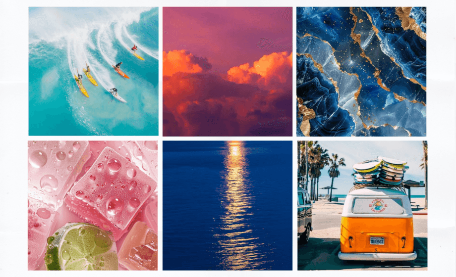
Blue and gold create a striking visual contrast that is both calming and energizing. This combination works well in various design settings, from interiors to branding.
Blue symbolizes trust, loyalty, and wisdom. It is a versatile color that can range from serene pastels to deep navy tones.
Gold brings in warmth and a sense of luxury. Its shimmering quality can elevate any palette, making it ideal for accent pieces or highlight details.
In fashion, pairing blue garments with gold accessories adds sophistication. Whether it’s a blue dress with gold jewelry or a suit accented with a gold tie, the look feels polished.
For interiors, blue walls paired with gold decor elements can create an inviting atmosphere. Consider gold frames, fixtures, or textiles to enhance the space.
In graphic design, this color combination can draw attention. Use gold text on a blue background for a striking effect that maintains readability and impact.


2) Pink and Green
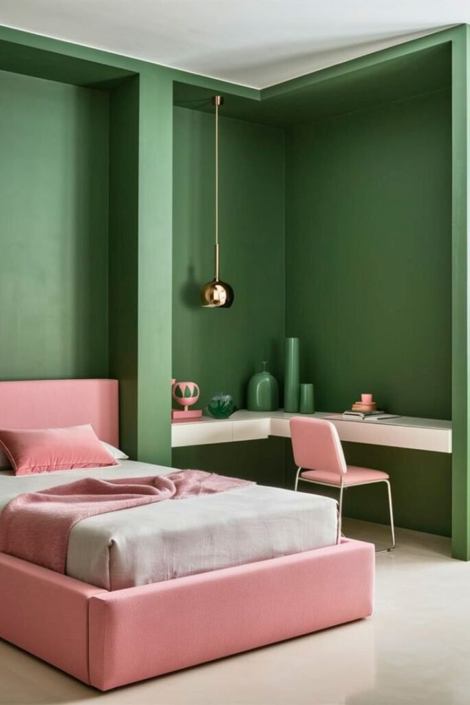
Pink and green create a vibrant and refreshing color combination. The softness of pink pairs well with the natural energy of green, making it appealing in various design contexts.
In interior design, these colors can promote a sense of tranquility. Light pinks can soften a space, while deeper greens add depth and visual interest. This combination is excellent for creating relaxed environments.
In fashion, pink and green can make a bold statement. You can mix floral patterns featuring these colors for a lively spring look. Alternately, you might choose a pink dress with green accessories to maintain balance.
These colors are often associated with spring and nature, bringing a sense of renewal. They work well in branding, where a cheerful and approachable image is desired. Use this combination to evoke feelings of optimism and freshness.


3) Red and White
Red and white create a striking and dynamic color combination. This pairing is often associated with strong emotions, energy, and clarity.
In design, red draws attention, evoking passion and excitement. White balances this intensity, providing a clean and timeless backdrop that enhances visibility.
You can use red and white in various contexts, such as branding, home decor, or fashion. For instance, a red dress with white accents can make a bold statement.
In branding, many companies utilize this combination to convey trust and strength. Logos featuring red and white are easily recognizable and can evoke a sense of urgency or action.
When decorating, red and white can brighten a space while maintaining a fresh and cheerful atmosphere. It works well in both modern and traditional settings.
Overall, red and white is versatile and impactful, making it a popular choice across different industries.


4) Black and Yellow
Black and yellow is a striking combination that commands attention. This pairing is often associated with energy and vitality, making it popular in design and branding.
The high contrast between black and yellow creates a bold visual effect. It is frequently used in safety signs and cautionary symbols, which emphasizes its visibility and importance.
In fashion, black and yellow can make a powerful statement. You might choose these colors to create a modern, edgy look or to stand out in a crowd.
In interiors, this combination brings a sense of dynamism. Black furniture with yellow accents can create a sophisticated and lively atmosphere, enhancing any space’s character.


5) Purple and Orange
Purple and orange create a striking contrast that can energize any design. These complementary colors work well together, offering a balance of cool and warm tones.
Using purple can evoke a sense of luxury and creativity. In contrast, orange brings warmth and vibrancy. Together, they can produce a dynamic look that catches the eye.
This combination can be particularly effective in interior design. Consider pairing purple walls with orange accents or decor to create a bold statement.
In graphic design, purple and orange can convey creativity and enthusiasm. This makes them suitable for brands aiming to stand out in a competitive market.
You can experiment with various shades to find the perfect balance. Dark purple with a bright orange can create a dramatic effect, while lighter shades can lend a playful vibe.


Understanding Color Theory
Color theory is a crucial aspect of design that helps you create visually appealing combinations. By familiarizing yourself with primary and secondary colors, as well as how they interact within the color wheel, you can enhance your understanding of effective color usage.
Primary and Secondary Colors
Primary colors consist of red, blue, and yellow. These colors cannot be created by mixing other colors. They serve as the foundation for a wide range of other hues.
Secondary colors emerge from mixing two primary colors. For example:
- Red + Yellow = Orange
- Blue + Yellow = Green
- Red + Blue = Purple
This interplay forms a basis for color mixing and can help you develop unique palettes in your designs.
The Color Wheel and Harmony
The color wheel is a circular illustration of colors arranged based on their relationships. It is divided into various sections that represent primary, secondary, and tertiary colors.
Color harmony involves combining colors in a way that is pleasing to the eye. You can achieve harmony through various schemes:
- Complementary Scheme: Uses opposite colors on the wheel.
- Analogous Scheme: Combines colors next to each other.
- Triadic Scheme: Involves three evenly spaced colors.
Understanding these concepts allows you to effectively balance your color choices, creating aesthetically pleasing designs.
The Impact of Color Psychology
Color psychology plays a significant role in design, marketing, and personal expression. Understanding how colors influence emotions and cultural perceptions can enhance your choices in various applications.
Emotional Responses to Colors
Different colors evoke specific emotional responses. For instance, red often evokes feelings of passion and urgency, making it effective for calls to action. Blue tends to create a sense of calmness and trust, which is why it is frequently used in corporate branding.
Other colors also have distinct associations:
- Yellow can generate feelings of happiness and optimism.
- Green is linked to nature, balance, and growth.
- Purple may symbolize luxury and creativity.
Recognizing these associations helps you select colors that align with the emotions you aim to convey or elicit in your audience.
Cultural Significance of Colors
Colors carry varying meanings across different cultures, impacting how they are interpreted. For example, white is often associated with purity and innocence in Western cultures, while in some Eastern cultures, it represents mourning and loss.
Similarly, red might symbolize good fortune in Chinese culture but denote danger in Western contexts. Understanding these cultural nuances is crucial for effective communication, especially in global applications.
By being aware of these significances, you can make informed decisions about color use that resonate appropriately with your audience’s cultural backgrounds.


