As the days grow shorter and a crispness enters the air, nature stages its most dramatic spectacle. The vibrant greens of summer recede, giving way to a rich, warm palette that blankets the world in comfort and nostalgia. At the heart of this seasonal transformation are the quintessential warm colors of fall: orange, terracotta, and brown. These hues are more than just beautiful; they are a deep psychological signal, a visual embrace that marks the shift into the cozy, contemplative months of autumn.
This isn’t just a trend; it’s a centuries-old aesthetic rooted in our connection to the harvest, fire, and the earth itself. Orange, terracotta, and brown are the emotional anchors of the season, and understanding their individual power and how they interact allows you to fully harness their warmth in your wardrobe, home, and daily life. They offer a sophisticated, grounded approach to fall style that moves beyond fleeting trends.
The Psychological Pull of Warm Fall Colors
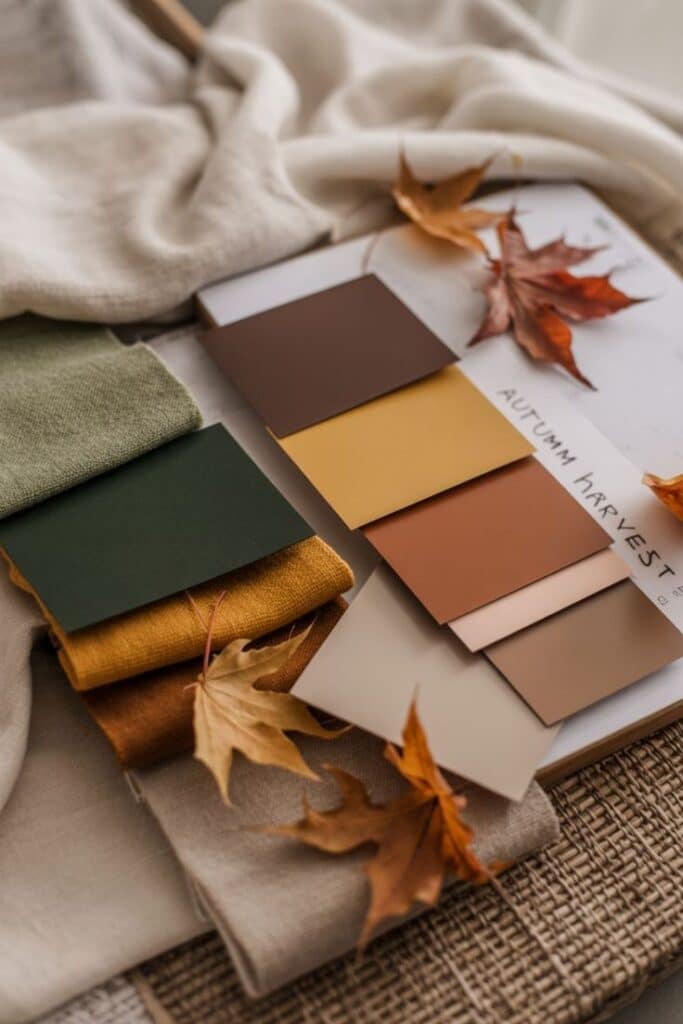
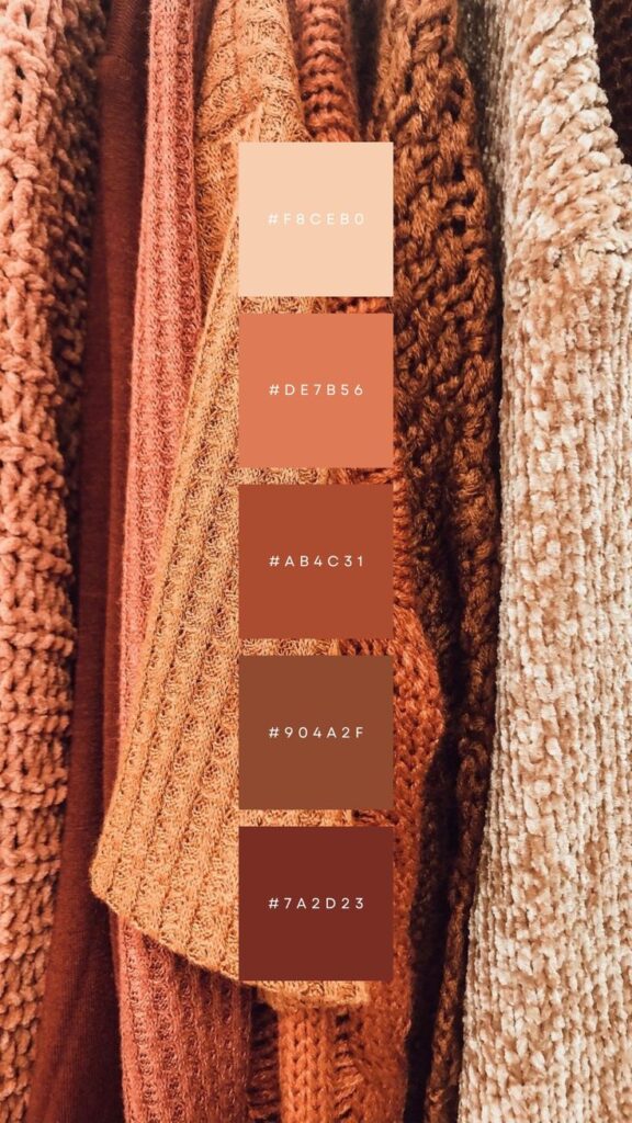
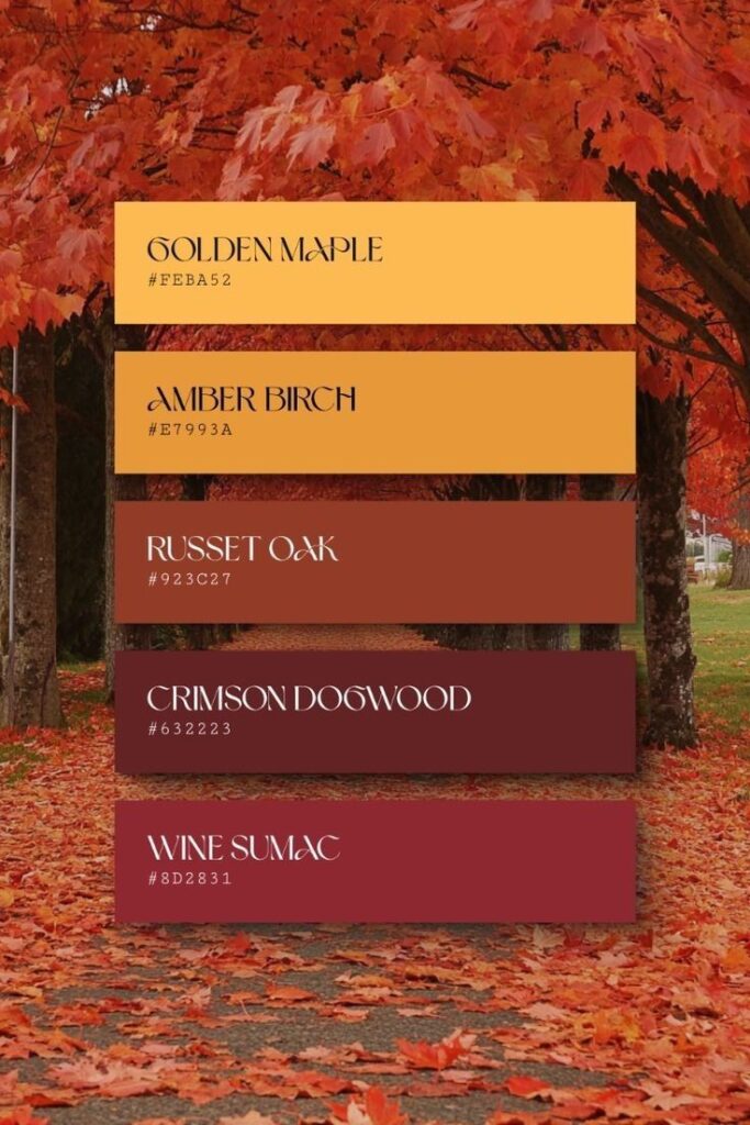
Why do these specific colors resonate so deeply with us when the weather cools? The answer lies in color psychology and our evolutionary history. Warm colors—those related to fire and sunlight—have a profound effect on our nervous system, stimulating feelings of safety, energy, and sociability.
A Scientific Study in Coziness
Research in environmental psychology supports this phenomenon. One notable study, published in the Journal of Environmental Psychology, found that rooms painted in warm autumn colors could increase occupants’ perceived temperature by an average of 3 to 4 degrees Fahrenheit compared to cool-toned rooms. This is “psychological warming” in action. Our brains associate these colors with heat, making us feel physically cozier just by looking at them.
Orange: The Spark of Enthusiasm
Orange sits at the crossroads of energizing red and cheerful yellow, making it the most vibrant and enthusiastic color of the fall trinity.
- Emotional Impact: Orange is a “social color.” It stimulates feelings of excitement, enthusiasm, and adventure. In the context of autumn, it is deeply tied to the harvest, signifying abundance, ripeness, and festive gatherings.
- Historical Context: Historically, orange has been a color of spiritual fire, transformation, and divinity in many Eastern religions, often worn by monks. In Western culture, it rose to prominence in the 1970s, symbolizing freedom, optimism, and the “back to earth” movement, which directly links to today’s love for its earthy shades.
- Key Shades: Think pumpkin spice, burnt orange, marigold, and rust. Burnt orange, specifically, with its added hint of brown, takes the color’s vibrancy and grounds it, making it universally appealing for clothing and decor.
Terracotta: The Grounding Earth
Terracotta is perhaps the most sophisticated of the trio. Its name, meaning “baked earth” in Latin, perfectly describes its rich, reddish-brown hue. It is an honest, ancient color.
- Emotional Impact: Terracotta is deeply grounding. It evokes a feeling of stability, reliability, and tradition. It is the color of clay, suggesting natural craftsmanship, simple lifestyles, and a connection to the material world. It offers comfort and slows us down, inviting reflection.
- Historical Context: Terracotta has been used in architecture and art for millennia, from the Great Wall of China to ancient Greek pottery. Its enduring use across civilizations makes it a timeless, non-trending shade. Its modern resurgence ties into a desire for natural, handcrafted elements in design.
- Key Shades: Look for shades ranging from the classic brick-red-orange to muted peachy clay and deep rust. Its nuanced nature allows it to bridge the gap between bright orange and deep brown seamlessly.
Brown: The Anchor of Security
Brown is fall’s ultimate psychological anchor. It is the color of the earth, wood, and rich soil, providing a profound sense of security.
- Emotional Impact: As we transition from the spontaneity of summer to the introspection of winter, we crave stability. Brown provides this, creating feelings of reliability, security, and being grounded. It is the ultimate neutral, adding a “psychological weight” to a space or outfit that makes it feel substantial and secure.
- Historical Context: Brown has long been associated with humility, practicality, and the working class. Today, rich, decadent shades like mocha and chocolate are embraced for their luxurious, high-quality feel, especially in materials like leather, suede, and rich wool.
- Key Shades: Explore chocolate brown, caramel, camel, espresso, and warm taupe. The darker shades offer a refined elegance, while the lighter tones provide a soft, buttery warmth.
Integrating Fall’s Warm Palette into Your Home Decor
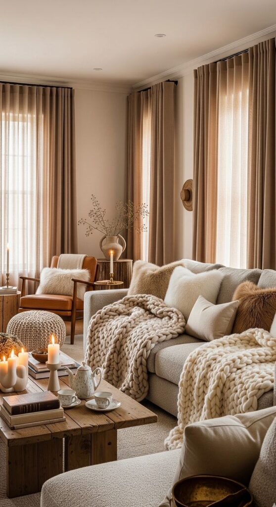
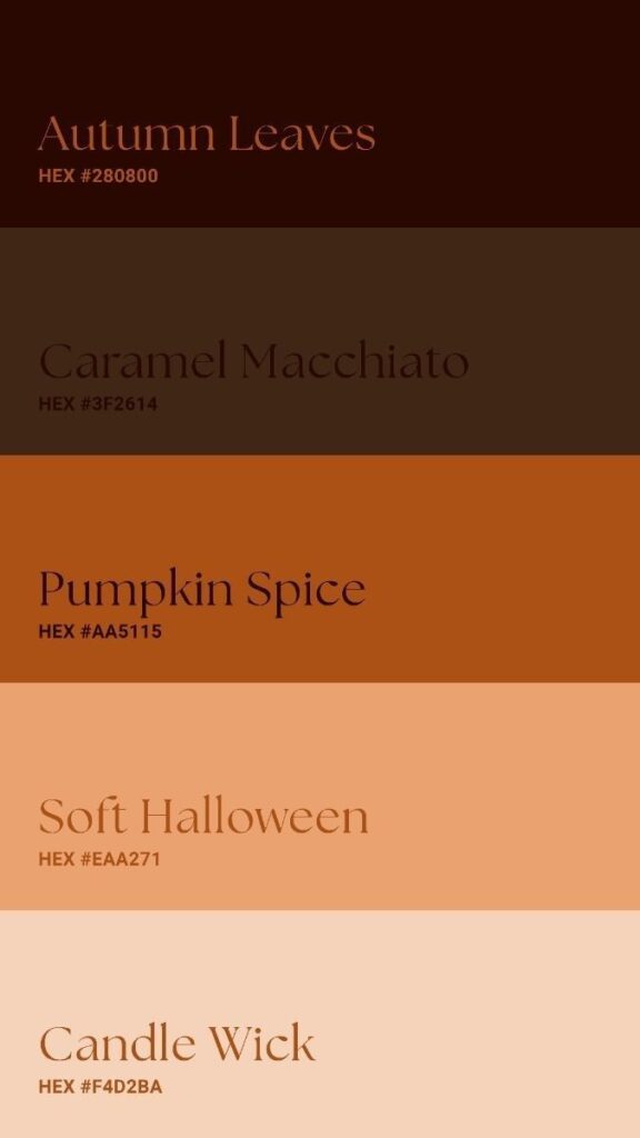
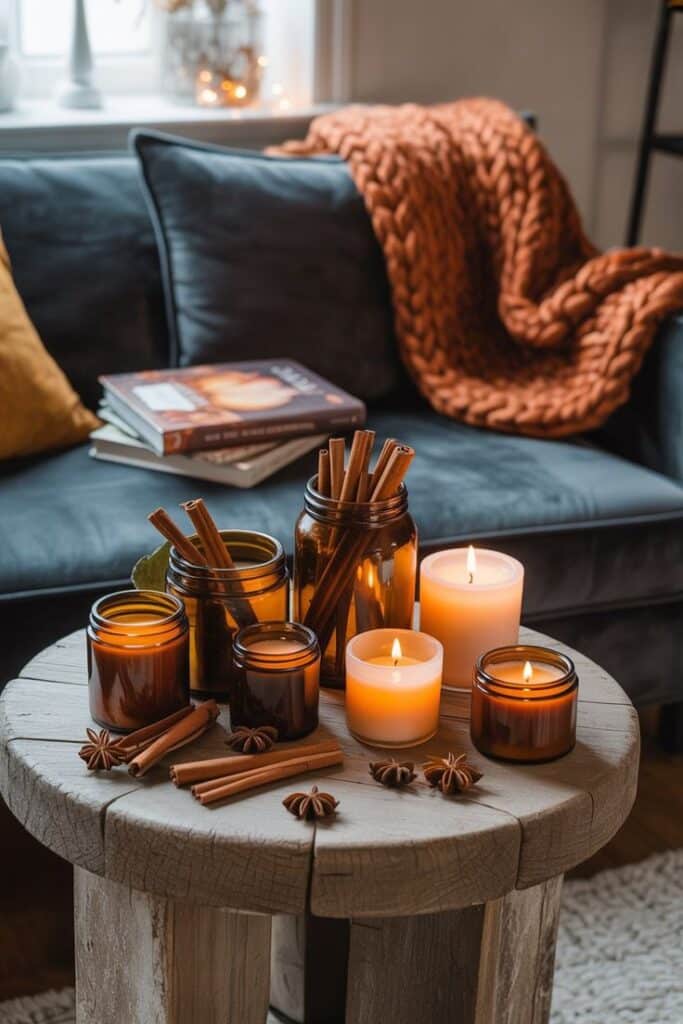
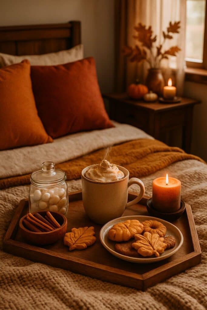
Translating the beauty of the outdoors into your living space creates a “restoration zone”—an emotionally supportive environment that encourages rest and recharging. The goal is to build layers of warmth and texture.
The Foundation: Walls and Large Pieces
You don’t need a complete overhaul to embrace this palette. Think of the 60-30-10 rule for color application:
- 60% Base (Warm Neutrals): Start with warm neutrals like cream, soft beige, or a light taupe for walls, large furniture (sofas, rugs), and curtains. This allows your warm colors to pop without overwhelming the space.
- 30% Medium Hues (Terracotta and Deep Brown): Introduce medium-intensity colors through upholstery or accent furniture. A terracotta-colored accent chair, a deep brown area rug, or wooden furniture with rich, warm stains fulfill this role. Terracotta accent walls, particularly in north-facing rooms, can bring unexpected warmth.
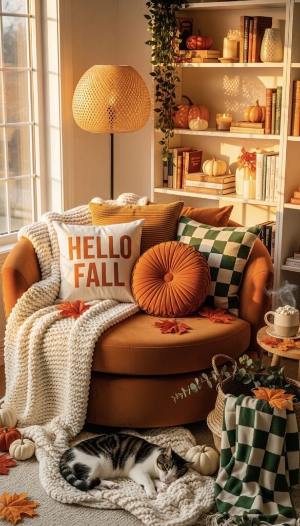
- 10% Accents (Vibrant Orange): Use vibrant orange sparingly for dynamic seasonal accents, like throw pillows, candles, or artwork. This pop of enthusiasm keeps the space feeling lively.
Layering Textures for Maximum Coziness
The success of a warm palette relies heavily on texture, as it mimics the natural materials these colors represent.
- Embrace Natural Fibers: Layer materials like raw wood, woven baskets, unfinished pottery (classic terracotta pots), leather, and linen.
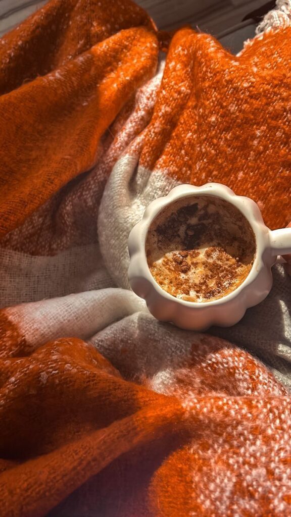
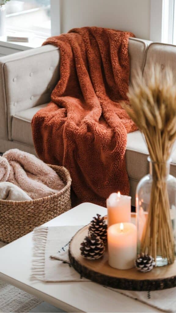
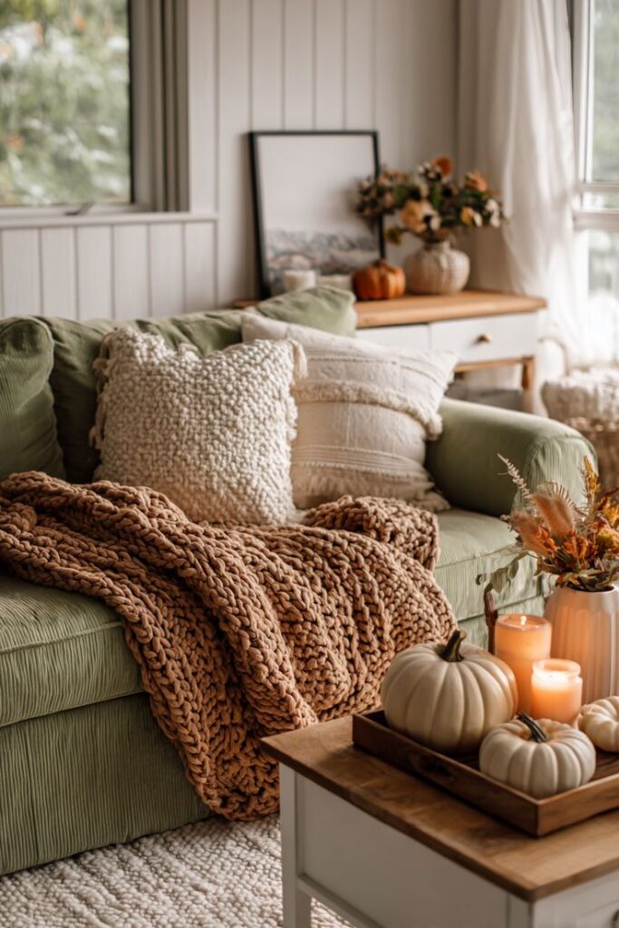
- Textile Play: Introduce throw blankets in chunky knits, faux fur, or soft wool in shades of caramel and burnt orange. Use velvet pillows for a touch of luxury in deep chocolate or rust.
- A Case Study in Harmony: A minimalist living room with white walls and a gray sofa can be instantly transformed by adding a textured, deep brown leather ottoman, a burnt orange throw blanket, and a collection of handmade terracotta planters holding dried floral arrangements. The cool tones provide the sophisticated contrast, while the warm tones provide the soul.
Strategic Color Pairings
While these colors are beautiful on their own, pairing them with the right contrasting shades enhances their warmth.
- Terracotta + Sage Green: This is an unexpected yet perfect pairing. The earthy, muted green provides a cool, natural balance to terracotta’s heat, mirroring the end-of-season foliage.
- Orange + Navy Blue: For a bolder look, a complementary pairing of vibrant orange with deep navy or steel blue creates a striking, energetic contrast that is often seen in mid-century modern design.
- Brown + Gold/Brass: Metallic accents in warm tones like gold and aged brass enhance the richness of brown and terracotta, adding a polished, sophisticated layer.
Autumnal Style: Dressing in the Warm Palette
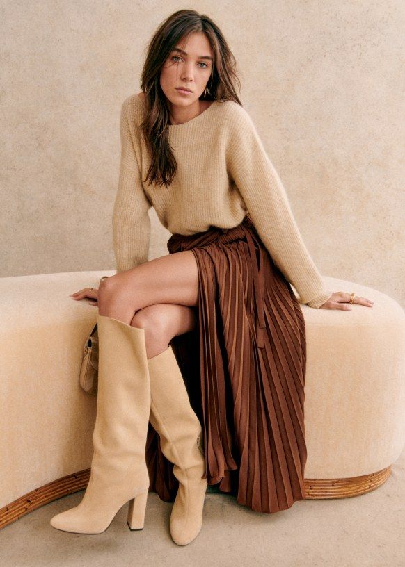
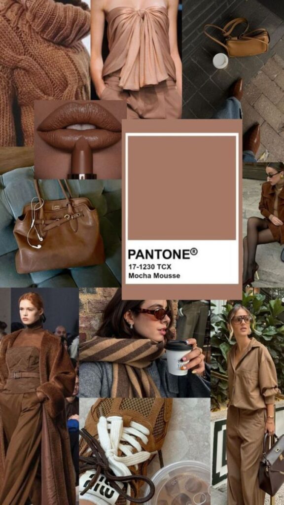
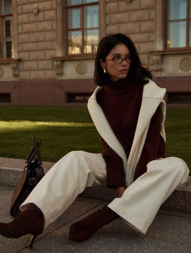
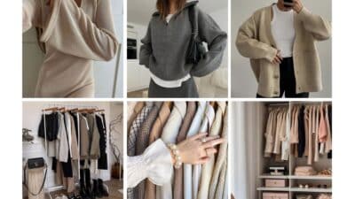
Fashion’s embrace of these warm hues is a perennial staple, evolving with new silhouettes and fabrications each year. They are universally flattering and create an immediate impression of warmth, confidence, and grounded elegance.
Orange: The Statement Piece
Orange in fashion should be a conscious, confident choice. The key is in selecting the right shade and texture.
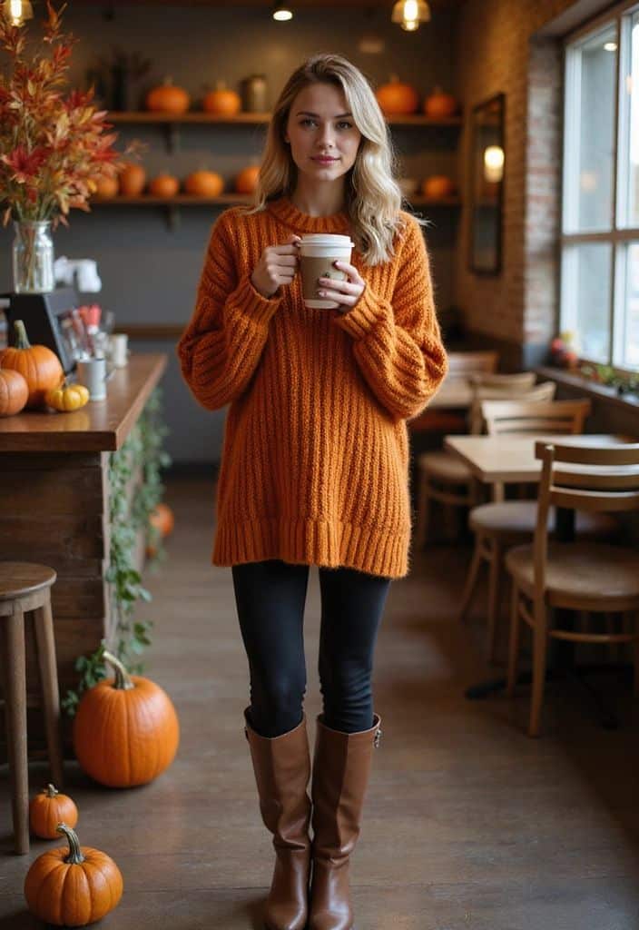
- Burnt Orange Knitwear: A chunky knit sweater or a long cardigan in burnt orange is the definitive fall piece. Pair it with dark wash denim and brown leather boots for an easy, classic look.
- Rust Trousers/Skirts: Wearing rust-colored corduroy trousers or a suede midi skirt adds a refined texture that grounds the bright hue.
- Accessories: Use vivid orange for accessories if you prefer a subtle touch. A silk scarf, a structured handbag, or even a bold nail polish color can be your nod to the season’s vibrancy.
Terracotta: The Sophisticated Neutral
Terracotta functions as a powerful, yet gentle, neutral in a fall wardrobe, offering more depth than a standard beige.
- Outerwear: A tailored wool coat or a structured blazer in a true terracotta shade is an investment piece. It pairs beautifully with black, navy, or deep brown, instantly elevating a professional look.
- Monochromatic Ease: A head-to-toe look in varying shades of terracotta—a peach blouse tucked into rust-colored pants—creates a luxurious, cohesive, and elongated silhouette.
- Bohemian Flair: The earthy nature of terracotta lends itself well to flowing fabrics, layered looks, and natural textures like linen and cotton for a sophisticated bohemian aesthetic.
Brown: The Luxurious Base
Current fashion trends elevate brown from a simple neutral to a statement color, focusing on rich, decadent shades and high-quality materials.
- Chocolate Brown is the New Black: Deep chocolate brown, particularly in sleek, liquid leather or tailored wool, is a major trend. A long brown trench coat or a pair of perfectly tailored trousers is a modern essential.
- The Power of Texture: Brown thrives on texture. Think suede jackets, cashmere turtlenecks, or rich, dark wood grain accessories. For Fall/Winter 2024, the trend for brown accessories—especially bags and shoes in soft suede—was particularly strong, signaling a return to natural elegance.
- Caramel and Camel Layers: Use lighter shades of brown, like camel and caramel, for foundational pieces. A camel-colored turtleneck paired with a deep brown skirt offers a chic contrast that remains entirely within the warm palette.
The Power of the Trio in Practice: Crafting a Balanced Aesthetic
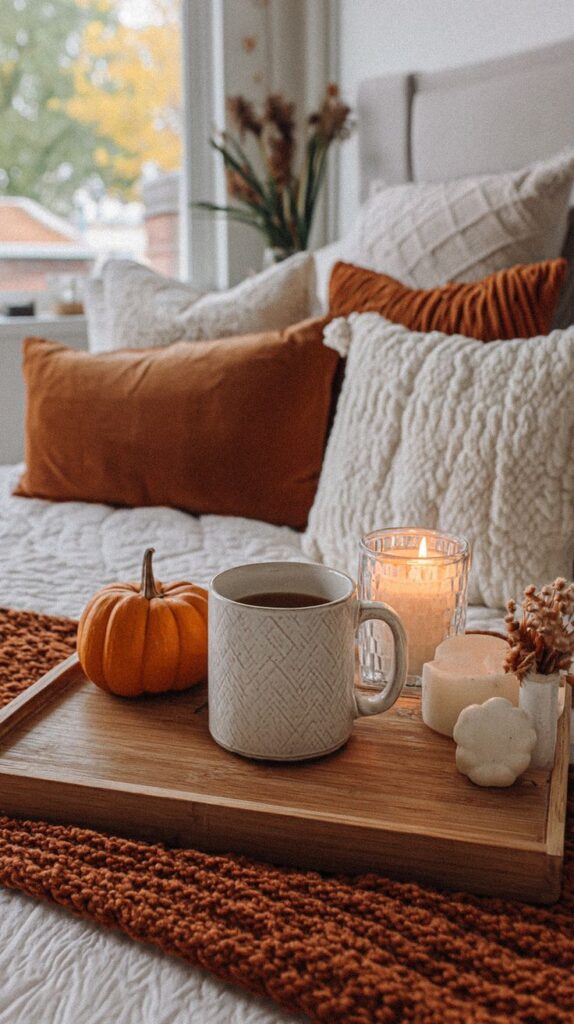
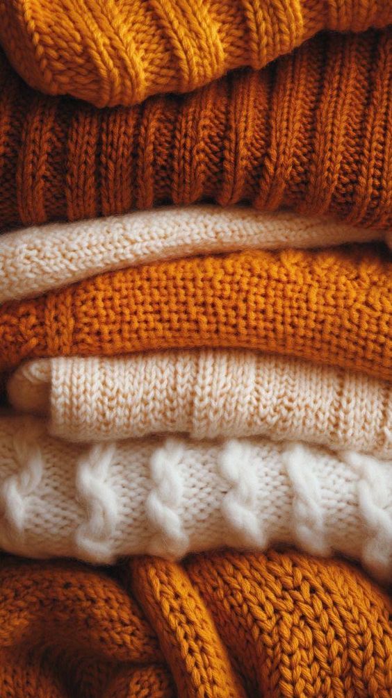
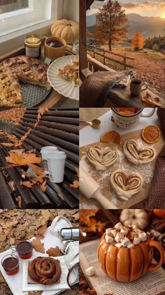
The true magic happens when you intentionally blend all three colors, creating a depth and richness that is inherently autumnal. This balance prevents orange from becoming too loud and brown from becoming too heavy.
Rule of Thirds in Design
When creating an arrangement—whether it’s a tablescape, a bookshelf display, or a flat-lay outfit—aim for a visual breakdown of the three colors.
- Example for an Entryway:
- Brown (The Ground): A dark wooden console table (providing the anchor).
- Terracotta (The Volume): A tall, textured terracotta ceramic vase.
- Orange (The Pop): A small cluster of vibrant, faux mini-pumpkins or a folded rust-colored throw.
Creating Depth Through Value and Saturation
Avoid using only highly saturated versions of each color. Mix light, muted tones with deep, rich ones.
- A light, warm taupe wall (Brown’s muted side)
- A classic, mid-tone brick-colored sofa (Terracotta)
- An accent pillow in a deep, vibrant burnt orange velvet (Orange’s high-saturation pop)
This interplay of light and dark, soft and vivid, is what makes the warm fall palette feel expensive and well-curated, offering a sophisticated alternative to the brighter palettes of summer.
Expert Insight: Color as a Communication Tool
Color experts and marketing strategists use these principles to evoke specific responses.
“When natural sunlight decreases, incorporating golden yellows and warm oranges helps maintain psychological brightness,” notes one environmental psychology report. This phenomenon is critical as it shows that choosing these colors isn’t just about style; it’s a form of seasonal self-care, a way to counteract the natural dip in energy that comes with shorter days.
Furthermore, these colors communicate trustworthiness and groundedness. Brands that use these hues often want to convey stability and reliability. When you choose to wear or decorate with them, you are projecting that same sense of quiet confidence and unshakeable security.
Conclusion: Living in the Warmth of the Season
Orange, terracotta, and brown are not merely colors; they are an embodiment of the season. They are the visual language of comfort, harvest, and introspection. By intentionally weaving these warm hues into your environment and personal style, you are doing more than just being “on-trend.” You are aligning your inner world with the gentle, grounded beauty of the outside world, creating spaces and looks that are emotionally supportive and inherently stylish.
Actionable Call to Value:
Don’t wait for a total redecoration or a shopping spree. Start small. Introduce a set of terracotta-hued napkins to your dining table, swap out your standard purse for a deep caramel leather bag, or simply light an amber-scented candle in a brown glass jar. Embrace the ember glow. Allow these colors to wrap you in a sense of safety and quiet joy, making this fall your most comfortable and elegant season yet. Start cultivating your sanctuary of warmth today.


