Ever gazed at a photograph and felt an instant connection, a rush of emotion, or a sudden sense of peace? Chances are, the masterful use of color in photography played a huge role in that experience. Color isn’t just a pretty embellishment; it’s a powerful storyteller, a mood-setter, and a vital tool for any photographer looking to create truly impactful images. It can transform an ordinary scene into something extraordinary, guide the viewer’s eye, and evoke feelings without a single word.
Think about it: a vibrant sunset against a silhouette, the cool blues of a misty morning, or the warm, inviting tones of a cozy indoor scene. These aren’t accidental; they’re often the result of intentional color choices, both in front of the lens and in post-production. But for many of us, navigating the world of color can feel a bit like trying to solve a Rubik’s Cube blindfolded. Where do you even begin? How do you make colors work for you instead of against you?
Fear not, fellow shutterbug! This isn’t some dry, academic lecture. We’re diving into a casual, hands-on guide to mastering color in your photography. We’ll explore the basics of how colors interact, how they make people feel, and practical ways to harness their power in your own shots. By the end of this journey, you’ll not only see color differently, but you’ll also be equipped to use it as a creative superpower, elevating your images from simple snapshots to captivating visual narratives. Let’s unleash that creativity!
The Building Blocks: Understanding Color Theory
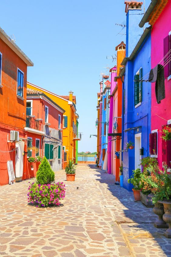
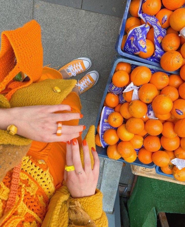
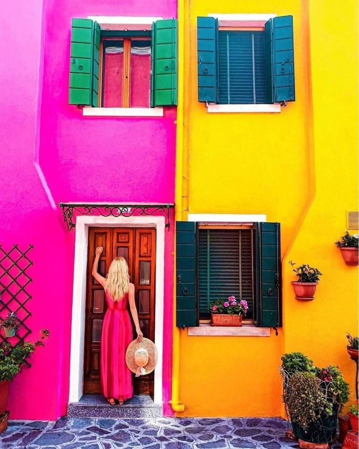
Before we start painting with light, let’s get cozy with the fundamental language of color. It’s not as complex as it sounds, and understanding these basics will be your launchpad for creative control.
Hue: The Color Itself
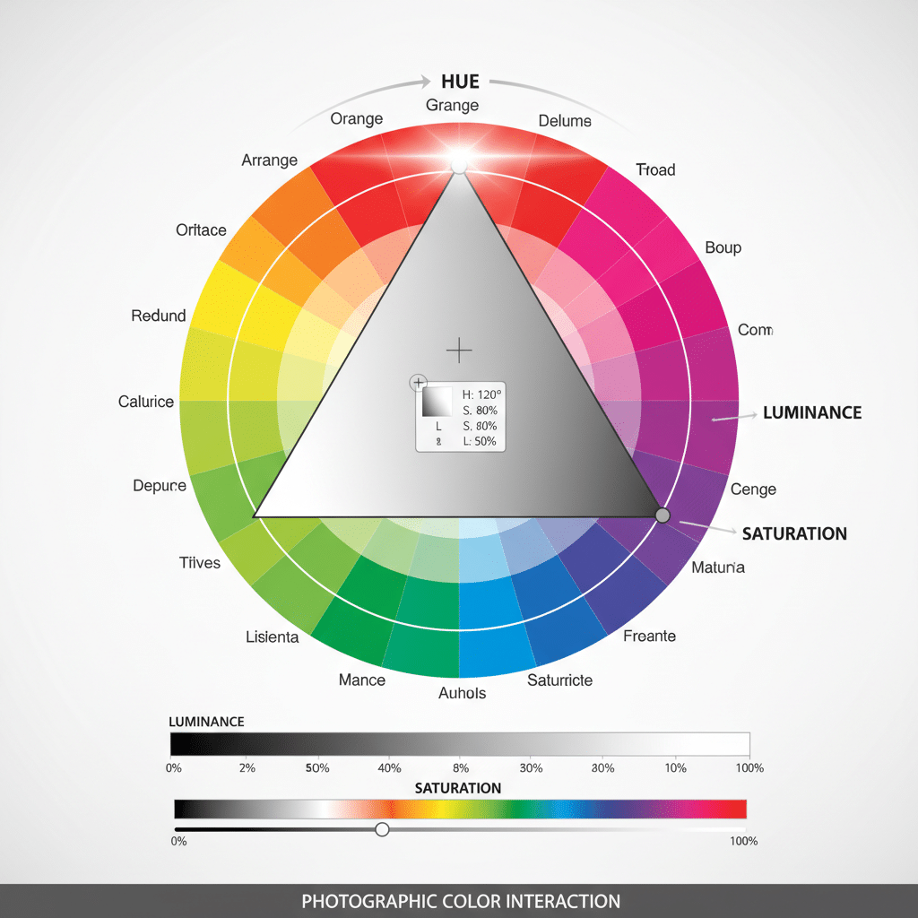
Simply put, hue is what we commonly call “color” – red, blue, green, yellow, orange, purple. It’s the dominant wavelength of light that our eyes perceive. The color wheel is your best friend here, visually organizing hues in a circular fashion. You’ll notice primary colors (red, yellow, blue) from which all other colors are mixed, and secondary (orange, green, purple) and tertiary colors derived from them. Knowing your hues helps you identify and name the specific colors you’re working with, which is the first step to manipulating them.
Saturation: The Intensity Meter
Saturation refers to the intensity or purity of a color. Think of it like a volume knob for color.
- High Saturation: Colors are vibrant, strong, and pure. They pop!
- Low Saturation (Desaturation): Colors are muted, dull, and move towards grayscale. If you turn the saturation all the way down, you get black and white.
Mastering saturation allows you to control the energy and mood of your photo. A highly saturated image often feels energetic and lively, while a desaturated one can evoke a sense of calm, nostalgia, or drama. It’s a fine line – too much saturation can make an image look garish or artificial, so use it wisely!
Luminance (Brightness): Light and Dark
Luminance, or brightness, refers to how light or dark a color appears. It’s about the amount of light reflected or emitted by a color.
- High Luminance: Lighter colors, closer to white.
- Low Luminance: Darker colors, closer to black.
Luminance is crucial for defining shapes, creating contrast, and guiding the viewer’s eye. A bright yellow will naturally draw more attention than a dark navy blue, even if both are highly saturated. Understanding luminance helps you create visual weight and depth in your compositions.
The Silent Language: Psychology of Color
Colors don’t just sit there looking pretty; they whisper (or sometimes shout!) emotions and messages directly to our subconscious. This is the realm of color psychology, and it’s incredibly powerful in photography. When you understand the profound impact of color psychology in educational spaces to create more conducive learning environments, you begin to grasp its broader application in visual communication, including your photos.
Let’s break down some common emotional associations with colors:
- Red: Passion, love, anger, danger, energy, excitement. It’s a highly stimulating color that demands attention. Think of a vibrant red dress against a neutral background – instant focal point!
- Orange: Enthusiasm, creativity, warmth, joy, determination. A friendly and energetic color, often associated with autumn and sunsets.
- Yellow: Happiness, optimism, warmth, caution, intellect. Bright and attention-grabbing, but too much can feel overwhelming.
- Green: Nature, growth, harmony, freshness, tranquility, jealousy. A versatile color that can be soothing or invigorating.
- Blue: Calm, serenity, sadness, trust, stability, intellect. Often associated with the sky and ocean, it can evoke feelings of peace or melancholy.
- Purple: Royalty, luxury, creativity, mystery, spirituality. A sophisticated color that can add a touch of drama or elegance.
- Pink: Sweetness, femininity, innocence, playfulness, romance.
- Brown: Earthiness, reliability, warmth, comfort, nature.
- Black: Power, elegance, sophistication, mystery, death, evil. Can add drama and strong contrast.
- White: Purity, innocence, cleanliness, simplicity, minimalism. Often used to create a sense of space and light.
- Gray: Neutrality, balance, sophistication, sometimes sadness or dullness. Can be a great backdrop to make other colors pop.
It’s important to remember that these associations can vary across cultures. For instance, white is associated with weddings in Western cultures but often with funerals in some Eastern cultures. Always consider your audience and the context of your image. By intentionally choosing dominant colors or color palettes, you can subtly steer the emotional narrative of your photographs, adding layers of meaning that viewers will instinctively understand.
Harmony and Contrast: Making Colors Sing Together
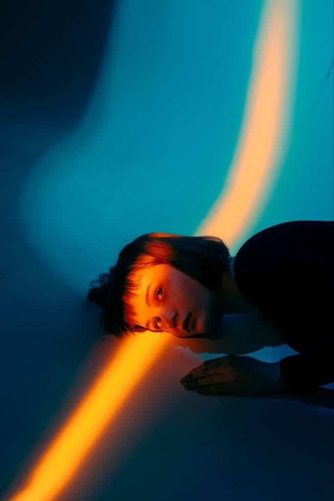
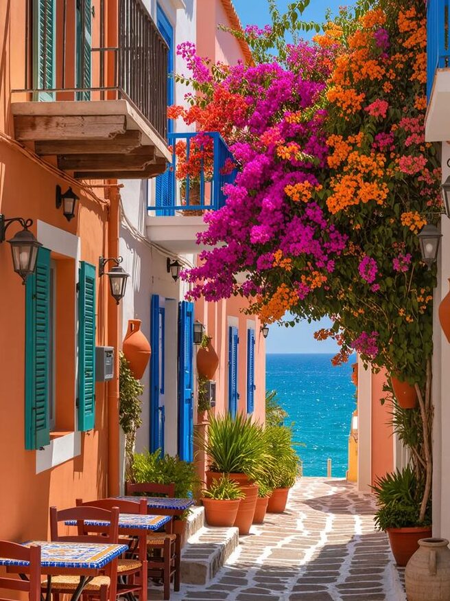
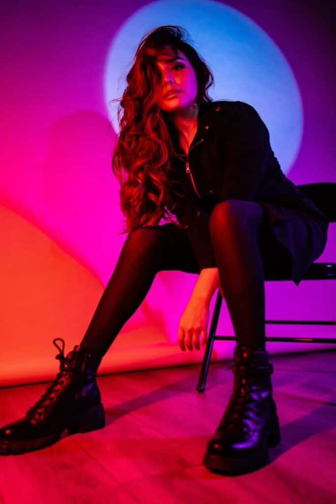
Just like notes in a song, colors can create harmony or dissonance. Understanding how colors relate to each other on the color wheel is your secret weapon for creating visually pleasing (or intentionally jarring) compositions.
Complementary Colors: The Dynamic Duo
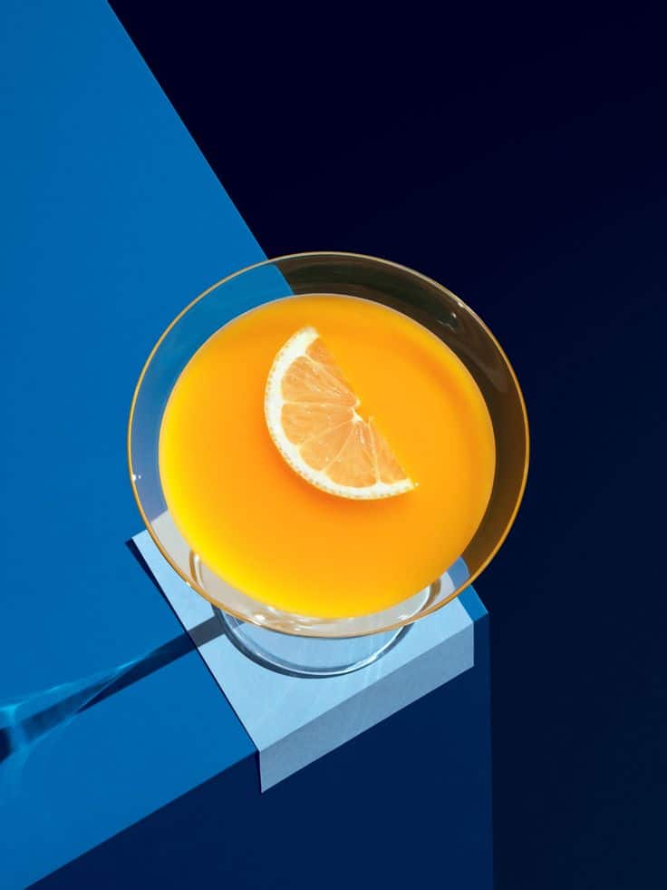
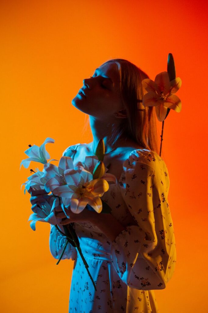
These are colors directly opposite each other on the color wheel – think red and green, blue and orange, yellow and purple.
- Effect: They create strong contrast and vibrant energy. When placed next to each other, they make both colors appear more intense.
- Use Cases: Perfect for making a subject pop or creating a dynamic, eye-catching image. Imagine a bright orange poppy in a field of lush green, or a blue boat against an orange sunset. The trick is to often let one color dominate, using the complementary color as an accent to avoid overwhelming the viewer.
Analogous Colors: The Harmonious Trio
Analogous colors are groups of three colors that are next to each other on the color wheel. For example, blue, blue-green, and green.
- Effect: They create a sense of harmony, peace, and often a cohesive, soothing feel. There’s less contrast than with complementary colors, leading to a calmer visual experience.
- Use Cases: Ideal for landscape photography (e.g., greens, blues, and yellows in a forest scene), or any scenario where you want a smooth, blended color palette. They work wonderfully for conveying a specific mood without jarring elements.
Triadic Colors: Balanced Vibrancy
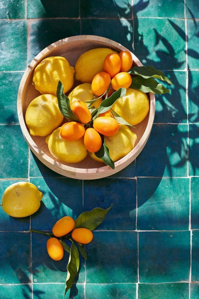
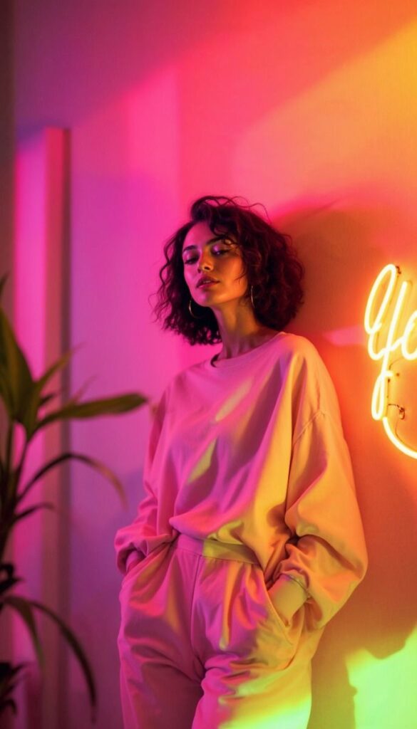
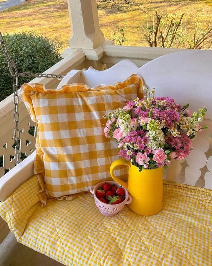
These are three colors that are equally spaced around the color wheel, forming a perfect triangle. Examples include red, yellow, and blue (the primary colors), or orange, green, and purple (the secondary colors).
- Effect: Triadic schemes are vibrant and stimulating, offering a good balance between harmony and contrast. They are often less intense than complementary schemes but still offer plenty of visual interest.
- Use Cases: Great for lively, playful, or balanced compositions. Think of a colorful street scene with subjects wearing clothes in a triadic scheme.
Monochromatic Colors: Elegant Simplicity
A monochromatic scheme uses different shades, tints, and tones of a single color. For example, varying shades of blue, from light sky blue to deep navy.
- Effect: This creates an elegant, subtle, and sophisticated look. It’s often used to convey mood, texture, and light without the distraction of multiple hues.
- Use Cases: Excellent for minimalistic shots, portraits where you want to emphasize emotion over vibrant clothing, or capturing the nuanced beauty of a single-color landscape (like a foggy morning).
Weaving Mood and Atmosphere with Color
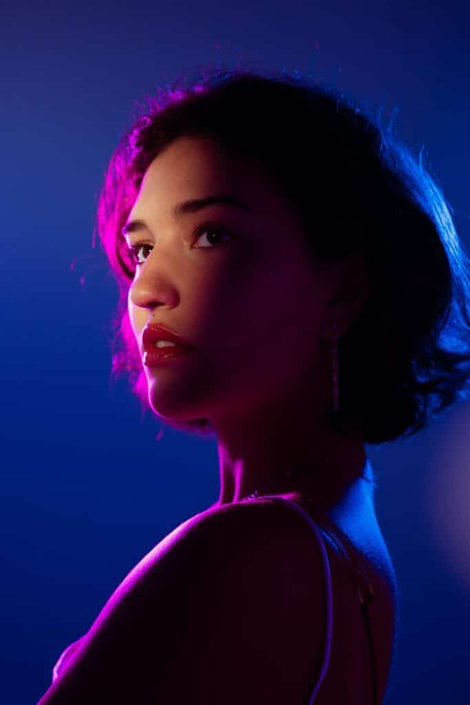
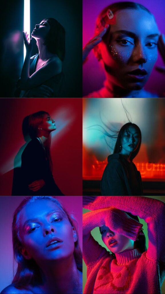
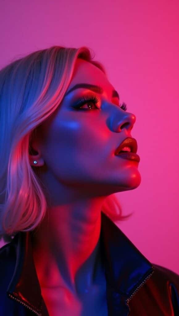
This is where color truly becomes an art form. Beyond just naming colors or understanding their relationships, we can actively use them to paint the emotional canvas of our images. Every hue carries a temperature and a feeling, and harnessing these can dramatically alter the viewer’s perception.
Warm vs. Cool Tones: Setting the Temperature
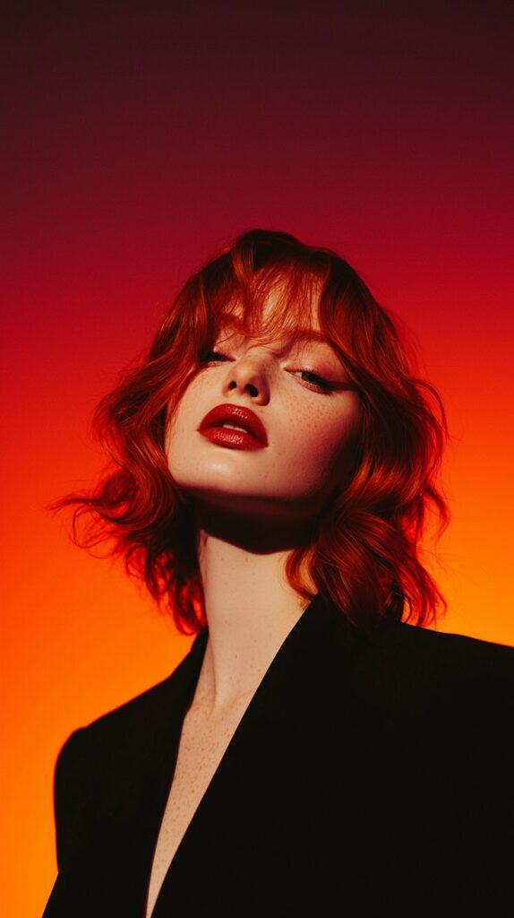
- Warm Tones: Reds, oranges, yellows. These colors tend to advance in an image, drawing the eye and evoking feelings of energy, passion, warmth, and excitement. A photo dominated by warm tones might feel like a cozy autumn evening or a fiery sunset.
- Cool Tones: Blues, greens, purples. These colors tend to recede, creating a sense of distance, calm, serenity, or even sadness. Think of a misty blue landscape or the cool, crisp light of dawn.
By choosing to emphasize warm or cool tones, you immediately infuse your image with a specific emotional temperature. A portrait shot with warm, golden light will feel intimate and inviting, while the same subject photographed in cool, diffused light might appear more contemplative or distant.
Dominant Color: Your Theme Song
Sometimes, a single dominant color can define the entire mood of a photograph. This doesn’t mean only using that color, but letting it take center stage, subtly influencing all other elements.
- Example: A photo where shades of blue dominate – the sky, the ocean, perhaps even blue clothing – will instantly feel serene and expansive. If the scene is mostly greens, it will evoke nature and growth. This is a deliberate choice, where you identify a color that best represents the feeling you want to convey and then compose your shot to feature it prominently. Think about how a bold color could be the central theme, similar to how bold wallpaper trends make a strong visual statement in interior design.
Subtlety vs. Boldness: The Right Volume
Not every image needs a riot of color. Sometimes, subtlety speaks volumes.
- Subtle Color: Think muted tones, desaturated palettes, or monochromatic schemes. This approach can create a sense of sophistication, melancholy, or quiet contemplation. It often highlights texture, light, and form more than overt color.
- Bold Color: High saturation, strong contrasts, and vibrant hues. This makes a statement, grabs attention, and feels energetic. It’s great for commercial work, celebratory moments, or when you want your image to literally pop off the screen.
The choice between subtlety and boldness depends entirely on your artistic vision and the story you want to tell. There’s no right or wrong, only what serves your purpose best. Experiment with both to understand their distinct impacts.
In-Camera Control: Your First Line of Defense
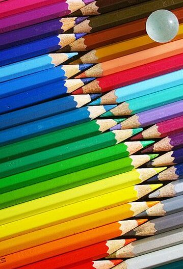
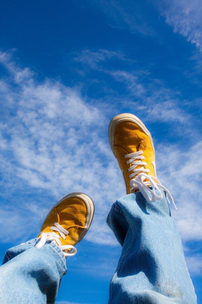
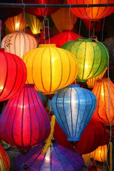
Before you even think about post-processing, remember that many crucial color decisions happen right in your camera. Mastering these settings gives you a significant head start and reduces the amount of correction needed later.
White Balance: The Color Thermostat
White balance (WB) is arguably the most critical in-camera color setting. Its job is to ensure that colors – especially white – appear natural under different lighting conditions. Our eyes are incredibly adaptable; a white shirt looks white whether you’re under warm tungsten bulbs or cool fluorescent lights. Your camera, however, needs a little help.
- Auto White Balance (AWB): Often does a decent job, especially in consistent light. But it can be fooled by dominant colors or mixed lighting.
- Presets: Your camera offers presets for common lighting conditions: Daylight, Cloudy, Shade, Tungsten, Fluorescent, Flash. These apply specific color temperature corrections. For example, the “Cloudy” preset warms up the image to counteract the cool cast of overcast skies.
- Custom White Balance: This is your most accurate option. You take a photo of a neutral gray card or a pure white object under the actual lighting conditions. Your camera then uses this reference to get the white balance spot-on. This is invaluable for critical color work, like product photography or studio portraits.
- Kelvin Temperature: Some cameras allow you to set the color temperature manually using the Kelvin scale. Lower Kelvin numbers (e.g., 2500K) mean warmer light (more orange/yellow), while higher numbers (e.g., 7500K) mean cooler light (more blue). This gives you precise control and allows for creative warming or cooling.
Getting white balance right in-camera saves you headaches later, especially if you’re shooting in JPEG (where WB is baked into the file). If you shoot RAW, you have much more flexibility to adjust WB in post, but starting close to correct is always a good practice.
Picture Styles/Profiles: Instant Mood Shifters
Most cameras offer various “Picture Styles” (Canon), “Picture Controls” (Nikon), or “Film Simulations” (Fujifilm) that apply pre-set adjustments to saturation, contrast, sharpness, and sometimes hue.
- Vivid/Landscape: Boosts saturation and contrast, often with a slight blue/green bias, making skies and foliage pop.
- Neutral/Flat: Reduces saturation and contrast, creating a “flatter” image with more detail in highlights and shadows. This is often preferred by photographers who want maximum flexibility for post-processing, especially when shooting video or in challenging light.
- Standard: A good all-around setting that offers a balanced look.
- Monochrome: Converts the image to black and white, often with options for color filters (e.g., red filter to darken skies).
While these styles primarily affect JPEG images, they can also influence how RAW files appear on your camera’s LCD and in some RAW converters (though you can always override them). Using a “Neutral” or “Flat” profile when shooting RAW gives you the most unadulterated data, allowing you to build your desired color profile from scratch in post-processing.
RAW vs. JPEG: The Power of Data
This isn’t strictly a “color setting,” but it profoundly impacts your ability to control color.
- JPEG: A compressed file format that processes the image in-camera, applying settings like white balance, picture style, and sharpening. While convenient, this discards a lot of color and tonal data, giving you less room to maneuver in post-processing without introducing artifacts.
- RAW: An uncompressed, unprocessed file that contains all the data captured by your camera’s sensor. Think of it as a digital negative. When shooting RAW, white balance and picture styles are recorded as metadata, not baked into the image. This means you have immense flexibility to adjust white balance, exposure, color, and more in editing software without losing quality.
For serious color control and creative flexibility, always shoot in RAW if your camera allows it. It gives you the power to truly master color in your photography.
Post-Processing Power: Refining Your Vision
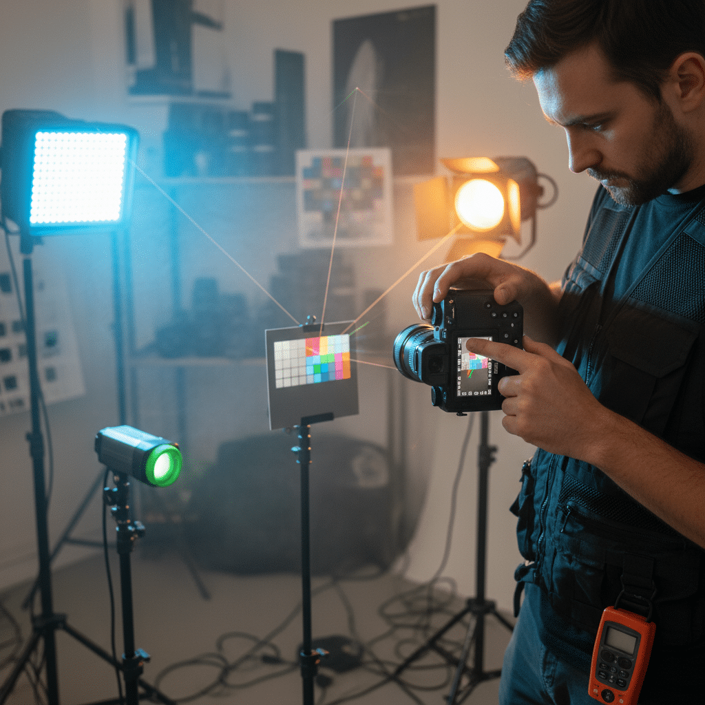
Even with perfect in-camera settings, post-processing is where you truly sculpt and refine your colors, bringing your artistic vision to life. Software like Adobe Lightroom, Photoshop, Capture One, or even mobile apps like Snapseed offer incredible tools to manipulate color with precision. If you’re looking to dive deeper, learning how to edit photos in Lightroom is an excellent starting point.
Basic Adjustments: HSL Sliders and White Balance
Your first stop for color manipulation will often be the HSL (Hue, Saturation, Luminance) sliders. These are incredibly powerful because they allow you to adjust specific color ranges independently.
- Hue: Change the actual color of a specific range (e.g., shift all greens slightly towards yellow or blue).
- Saturation: Increase or decrease the intensity of specific colors (e.g., make the reds pop without affecting the blues).
- Luminance: Brighten or darken specific colors (e.g., make blue skies darker and more dramatic, or lighten skin tones).
Beyond HSL, meticulously adjusting white balance in post is crucial. Even if you got it mostly right in-camera, fine-tuning with temperature (cool/warm) and tint (green/magenta) sliders can perfect skin tones, neutralize color casts, and enhance the overall mood.
Color Grading: The Cinematic Touch
Color grading is about applying an overall color cast to your image to evoke a specific mood, often seen in films and high-end photography. It’s more than just adjusting individual colors; it’s about defining the entire color palette.
- Examples: A cool, desaturated look for a gritty, dramatic scene; a warm, golden glow for a romantic, nostalgic feel; or vibrant, punchy colors for an energetic, celebratory image.
- Tools: In Lightroom, the Calibration panel, Split Toning, and the new Color Grading panel (which combines split toning with midtone adjustments) are fantastic for this. Photoshop offers Curves, Color Balance, Selective Color, and Gradient Maps for even more precise control.
Color grading can transform the feeling of an image, making it cohesive and visually striking. It’s a key technique for developing a signature photographic style.
Split Toning: Adding Depth to Highlights and Shadows
Split toning allows you to add different color casts to the highlights and shadows of your image.
- How it works: You might add a warm sepia tone to the highlights and a cool blue tone to the shadows.
- Effect: This creates a sophisticated, often cinematic look, adding depth and interest to the image. It’s excellent for creating specific moods, like a vintage feel or a dramatic contrast between warm and cool elements.
Targeted Adjustments: Brushes and Masks
Sometimes, you only want to adjust color in a specific area. This is where local adjustment tools come in handy.
- Adjustment Brushes: “Paint” on adjustments (like increased saturation or a hue shift) to specific areas.
- Radial and Graduated Filters: Apply adjustments with a gradient effect, great for modifying skies, foregrounds, or drawing attention to a central subject.
- Luminance/Color Range Masks: Apply adjustments only to specific colors or brightness ranges, allowing for incredibly precise local control.
Mastering these post-processing tools will empower you to fine-tune every aspect of color in your photographs, turning good shots into truly exceptional ones.
Practical Playbook: Techniques for Creative Color Use
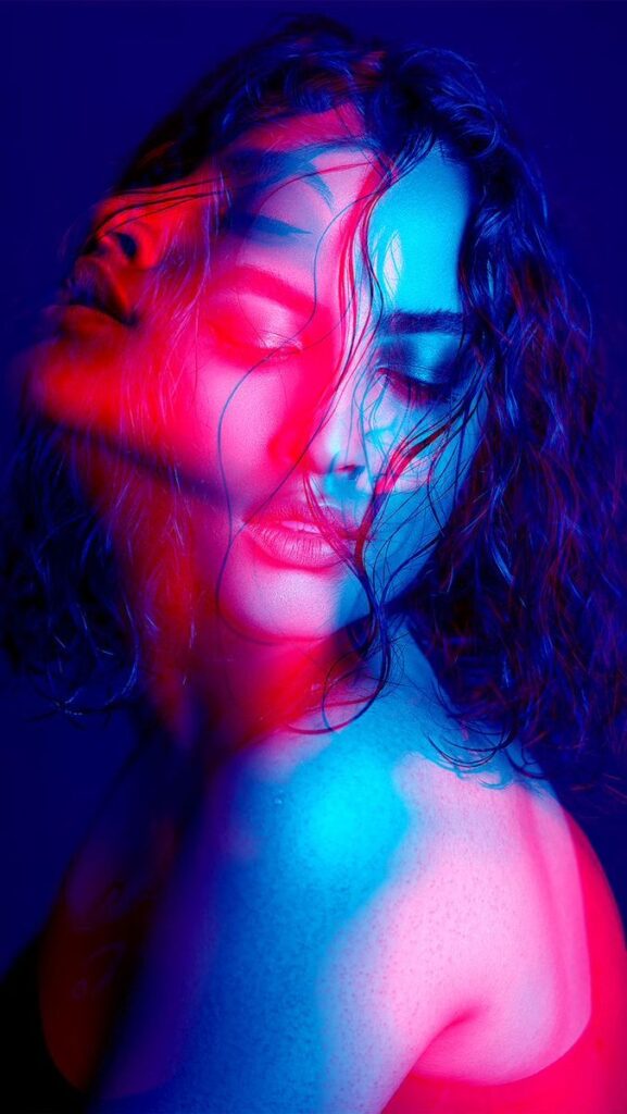
Now that we’ve covered the theory and the tools, let’s get into some hands-on techniques for incorporating color creatively into your photography.
Color as a Subject: The Unmissable Pop
Sometimes, the color is the story. Find an object with a striking, vibrant hue and make it the hero of your shot.
- Example: A bright red umbrella against a gray, rainy city street; a lone yellow flower in a field of muted greens.
- Technique: Compose to isolate this colored object, perhaps using shallow depth of field or by finding a contrasting, less colorful background. This creates immediate impact and draws the eye directly to your chosen color.
Color to Guide the Eye: The Visual Path
Colors can act as arrows, leading your viewer through the frame.
- Technique: Look for lines or shapes made of color that naturally guide the eye from one point to another. A row of brightly colored beach huts leading towards the ocean, or a path of autumn leaves with varying shades of red and gold.
- Effect: This creates a dynamic composition and helps the viewer explore your image in a curated way.
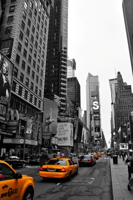
Color Isolation: Making One Color Pop
This technique involves making one specific color stand out by desaturating or muting everything else.
- Technique: In post-processing, use the HSL sliders to desaturate all colors except the one you want to emphasize. Some software also has specific “selective color” tools.
- Effect: Dramatically highlights your subject and can create a powerful, artistic statement. Think of the iconic red coat in Schindler’s List or a single vibrant flower in an otherwise monochrome landscape.
Color Repetition: Rhythm and Harmony
Repeating a particular color throughout your frame creates a sense of rhythm, unity, and harmony.
- Technique: Look for scenes where the same color appears multiple times, perhaps in different objects or varying shades. For instance, a person in a blue shirt standing next to a blue wall, under a blue sky.
- Effect: This provides visual continuity and can be very pleasing to the eye, reinforcing a dominant mood or theme.
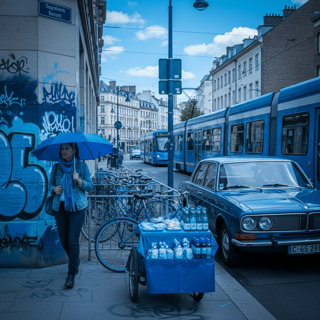
Minimalist Color Palettes: Less is More
Sometimes, restricting yourself to a very limited color palette (two or three key colors) can create incredibly impactful and sophisticated images.
- Technique: Seek out scenes where only a few distinct colors are present. This often means simplifying your composition and focusing on form and texture.
- Effect: Results in clean, elegant, and often very modern-looking photographs. It forces you to be deliberate with every color choice.
Contrasting Backgrounds: Subject Definition
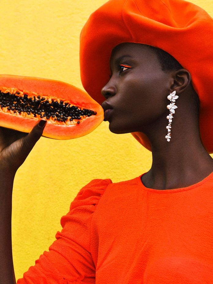
Use a background whose color strongly contrasts with your subject to make the subject really stand out.
- Technique: If your subject is warm-toned, look for a cool-toned background, and vice-versa. For example, a red apple against a green background, or a yellow taxi against a dark blue sky.
- Effect: This provides excellent separation and makes your subject pop.
Shoot in Different Light: The Magic Hour and Beyond
The quality and color of light change dramatically throughout the day, and understanding this is crucial for capturing specific color moods.
- Golden Hour: The hour after sunrise and before sunset. The low sun creates warm, soft, golden light, perfect for portraits and landscapes with a magical, inviting feel.
- Blue Hour: The period just before sunrise and just after sunset. The sky takes on deep blue, tranquil tones, offering a cool, mysterious, or serene atmosphere.
- Overcast Days: Soft, diffused light with very little contrast. Colors can appear muted but very pure and saturated, as there are no harsh shadows. Ideal for close-ups, portraits, and capturing subtle color variations.
By consciously seeking out and utilizing these different lighting conditions, you can significantly influence the color palette and emotional impact of your photographs.
Cultivating Your Color Eye
Mastering color isn’t just about learning rules; it’s about developing an intuitive understanding and appreciation for how colors interact. It’s like learning a new language – you start with grammar, but true fluency comes from immersion and practice.
Practice, Practice, Practice
The most important advice is to simply shoot more!
- Challenge yourself: Go out with the specific intention of focusing only on color. Try to capture a monochromatic scene, then a complementary one. Photograph the same object at different times of day to see how the light changes its color.
- Experiment with settings: Play with white balance, picture styles, and post-processing sliders. Don’t be afraid to push boundaries to see what happens, then dial it back to what looks good.
Study Art, Movies, and Design
You don’t just learn color from photography; you learn it from the world around you.
- Fine Art: Visit museums (virtually or in person) and study how painters use color. Look at Impressionist landscapes, vibrant Pop Art, or subtle still lifes. How do they evoke mood?
- Cinema: Pay attention to the color palettes in your favorite movies. Notice how directors use color grading to define genres, character moods, or narrative arcs.
- Design: Explore other design disciplines. Look at latest interior design trends, fashion, graphic design, and even advertising. Designers are masters of color psychology and harmony.
- Nature: The ultimate teacher! Observe sunsets, forests, oceans, and flowers. Notice the subtle shifts, the bold contrasts, and the incredible harmonies.
Analyze Photos You Admire
When you see a photograph whose colors you love, don’t just scroll past. Stop and analyze it.
- What are the dominant colors?
- Are they warm or cool?
- Is the saturation high or low?
- Are there complementary or analogous harmonies at play?
- How does the light affect the color?
- What mood does the color create?
- Try to reverse-engineer their techniques.
Build Your Own Color Library
As you shoot, start noticing what colors you’re drawn to. Do you prefer warm, earthy tones or cool, ethereal blues? Are you a fan of bold, high-contrast colors, or do you gravitate towards soft, muted palettes? Developing your personal “color signature” is a huge part of finding your unique photographic voice. It’s about combining your technical understanding with your artistic sensibilities.
Remember, there are no hard and fast “rules” that can’t be broken, but you need to understand them first. Color is a tool for expression, and your ultimate goal is to use it to tell your story, in your way.
Conclusion
Phew! We’ve covered a lot of ground, haven’t we? From the basic building blocks of hue, saturation, and luminance to the deep emotional currents of color psychology, and from the in-camera controls to the post-processing wizardry that brings it all to life. We’ve even dipped into practical techniques and navigated some common pitfalls.
The world of color in photography is vast, exciting, and endlessly fascinating. It’s a journey, not a destination. Don’t feel overwhelmed by all the information. Instead, see it as a treasure chest of possibilities waiting for you to unlock. Each time you pick up your camera, you have the power to wield this incredible tool, to paint with light and shadow, and to infuse your images with feeling and meaning.
So, what’s next? Your adventure truly begins now. Take what you’ve learned, step out with your camera, and start experimenting. Look at the world through a new lens, one that sees color not just as a visual element, but as an emotional language. Play with white balance, try out different color harmonies, and don’t be afraid to push the boundaries in post-processing. Observe, learn, create, and most importantly, have fun! Your unique vision is waiting to be expressed, and color is your ultimate ally in making it shine.


