Picking the right color palette for your home can feel overwhelming, but a well-chosen scheme not only looks great—it also creates a peaceful, cohesive space you’ll enjoy every day. The key is to choose colors that reflect your personal style and create the kind of atmosphere you want in each room, while also making sure the hues flow well together throughout your home. With a few simple guidelines, you can transform any space to suit your taste and make every room feel just right.
You don’t have to be an interior designer to confidently select colors you’ll love. Learning a bit about color basics and knowing how to match your choices with the mood you want will help you create a beautiful, inviting home that truly feels like yours.
Key Takeaways
- Understand how colors set the tone for each room.
- Build a palette that keeps your whole home feeling connected.
- Use simple steps to make color selection easy and enjoyable.
Understanding Color Theory Basics
Color theory gives you a foundation for making informed choices when selecting your home’s color palette. By learning how colors relate and interact, you’ll make it easier to create visually appealing and comfortable spaces.
The Color Wheel
The color wheel is a circular diagram that arranges colors in a specific order. It helps you visualize how colors blend and contrast with each other. You’ll see familiar shades spanning from red, yellow, and blue around to green, orange, and purple.
With the wheel, you can spot which colors are warm (reds, oranges, yellows) and which are cool (blues, greens, purples). This distinction matters because warm colors tend to create energetic, cozy atmospheres, while cool tones evoke calm and spaciousness. Using a color wheel simplifies the process of finding harmonious color combinations.
Here’s a simple color wheel:
| Red | Yellow | Blue |
| Orange | Green | Purple |
Primary, Secondary, and Tertiary Colors
Every color on the wheel comes from mixing a small group of basic shades. Primary colors—red, yellow, and blue—can’t be made by combining other colors. They form the basis for all other hues.
Secondary colors are made by mixing two primary colors:
- Red + Yellow = Orange
- Yellow + Blue = Green
- Blue + Red = Purple
Tertiary colors result when you mix a primary with a neighboring secondary color, such as red-orange or blue-green.
Understanding these categories helps you layer colors intentionally. You’ll better anticipate how mixing shades affects the mood and look of a space, whether you want something bold or more muted.
Color Relationships and Harmony
Color harmony refers to pleasing and balanced arrangements of colors. Using the color wheel, you can identify different relationships to guide color selection:
- Complementary: Colors opposite each other (e.g., blue and orange) create vibrant contrast.
- Analogous: Neighboring colors (like green, blue-green, and blue) feel unified and soothing.
- Triadic: Evenly spaced colors (such as red, yellow, and blue) offer both contrast and balance.
Choosing the right relationship can set the tone for a room. Harmonious palettes make a space feel inviting, not overwhelming. Whenever you’re unsure, try picking two or three related colors to maintain visual balance while adding interest.
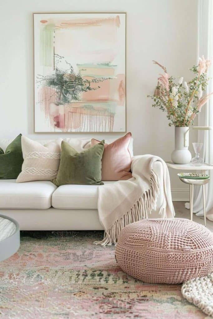
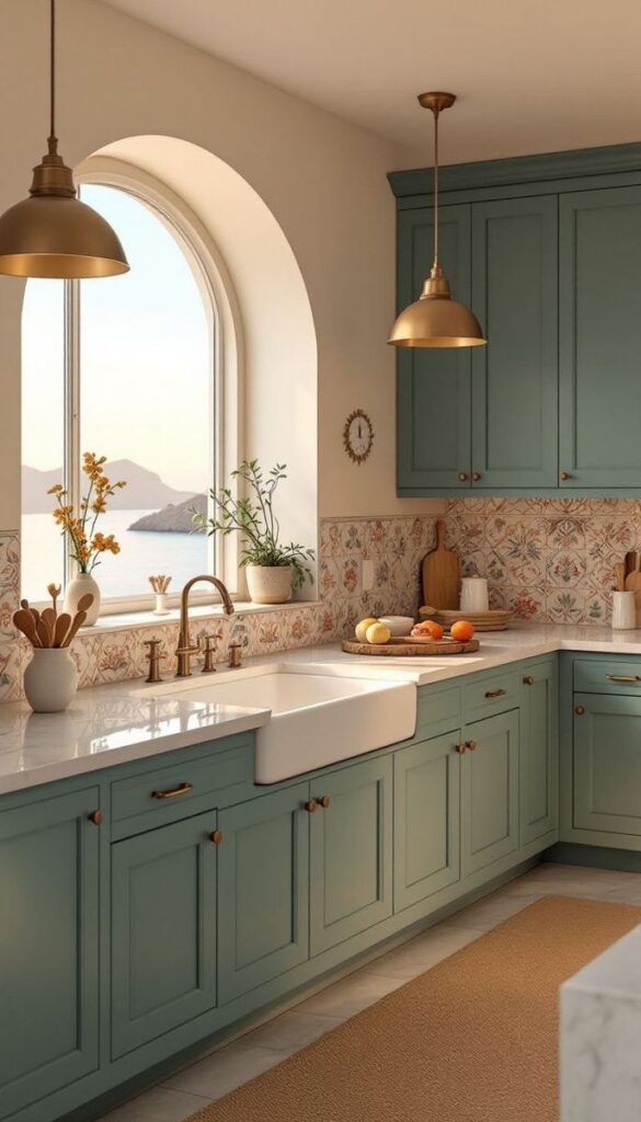
Defining Your Home’s Mood and Style
Deciding how your home should look and feel starts with knowing your own preferences and the atmosphere you want to create. Color choices not only reflect your personality but also influence how each room feels and how spaces flow together.
Identifying Your Personal Style
Start by thinking about what styles attract you most—modern, traditional, bohemian, minimalist, or another aesthetic. Reflect on items you already own and enjoy. Consider your favorite clothing colors or patterns, as they can hint at your preferred palette.
Look at magazines, design websites, or social media to gather inspiration. Save images, make notes, and pinpoint repeating themes. Write down three adjectives that describe the feeling you want in your home, such as “cozy,” “bright,” or “sophisticated.”
Visualize how your daily routine matches your ideal space. For example, if you entertain often, a lively or vibrant aesthetic might suit you. If relaxation is your priority, soft neutrals or calming tones might feel best.
The Impact of Mood and Color Psychology
Color has a strong effect on emotion and behavior. Warm colors like red, orange, and yellow can make rooms feel energetic or welcoming. Cool colors such as blue and green are calming and often used in bedrooms or bathrooms.
Think about the mood you want in each space. Use the table below to match common room types with color moods:
| Room | Desired Mood | Suggested Colors |
|---|---|---|
| Living Room | Inviting | Warm neutrals, greens |
| Kitchen | Energetic | Yellows, reds |
| Bedroom | Calm | Blues, soft whites |
| Office | Focused | Cool grays, blues |
Understanding color psychology helps you pick shades that match your intentions, not just your tastes.
Creating a Mood Board
A mood board brings ideas together visually. Collect images, paint swatches, fabric pieces, and photos that represent your favorite styles and colors. Organize them on a board or use digital tools like Canva or Pinterest.
Include samples of flooring, furnishings, and decor to see how all elements work as a group. Move items around until the combination fits your vision. This process helps spot clashing colors or missing elements early.
Keep your mood board nearby during the decorating process. This reference will guide your choices and keep your aesthetic and color palette consistent throughout each room.
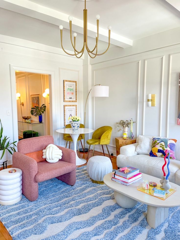
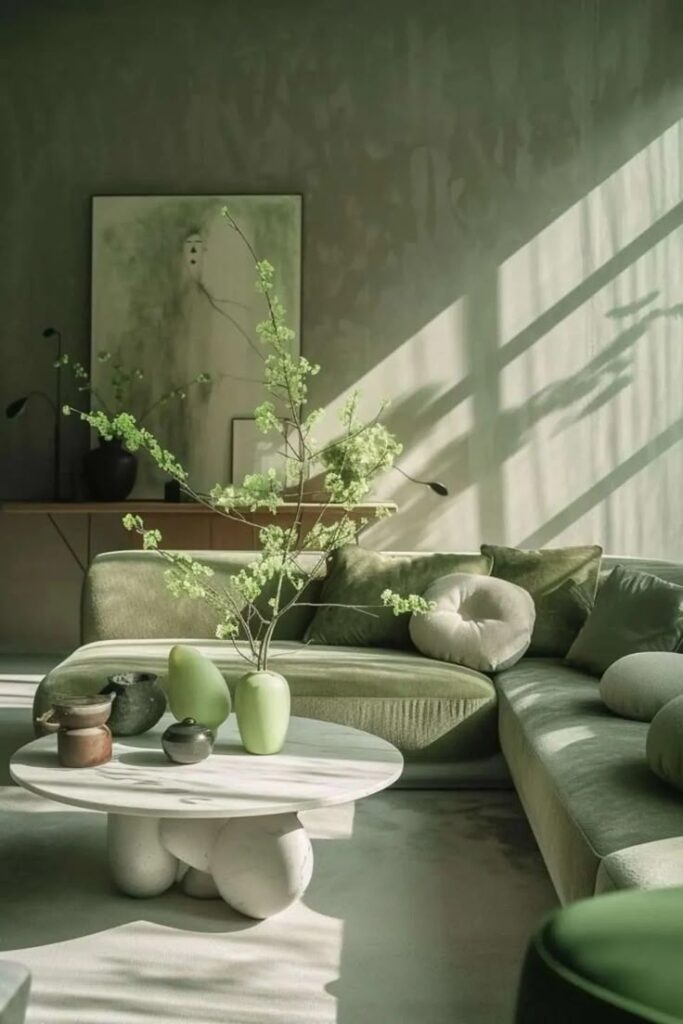
Choosing a Cohesive Color Palette
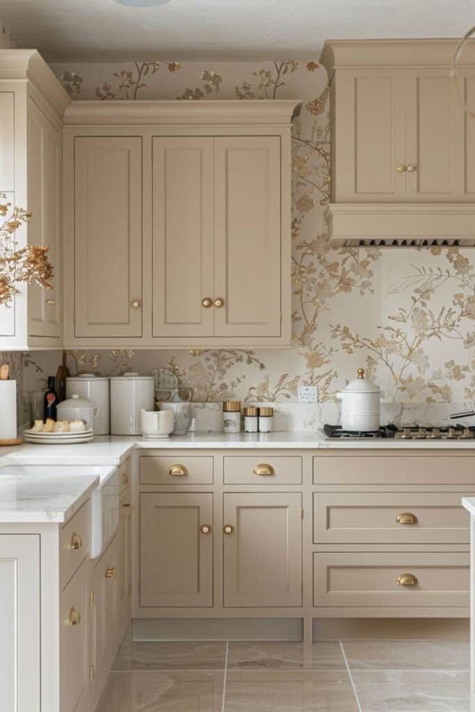
A cohesive home color palette makes your space feel connected and balanced. Carefully selecting your dominant base color, then adding secondary and accent colors, helps achieve a polished, harmonious look.
Selecting a Dominant Base Color
Your dominant color sets the foundation for your entire home. This base is usually the most visible color in a room, covering walls, large furniture, or flooring. Neutrals like beige, soft gray, white, or pale pastels work well, as they’re versatile and calming.
Think about natural light, room size, and mood when picking your base. If you love warmth, lean toward cream or taupe. For a crisp and clean palette, cool grays or light blues are great choices.
Stick with your dominant color throughout main areas to unify spaces. Carrying a single base color from the living room through hallways and into open-plan areas helps everything feel more connected.
Integrating Accent and Secondary Colors
Accent and secondary colors bring personality and depth to your palette. Secondary colors support the dominant base, often appearing in rugs, curtains, or furniture. Accent colors are bolder, showing up in art, decor, or pillows for eye-catching contrast.
When choosing these colors, look at the color wheel. Complementary shades (opposite on the wheel) can add energy, while analogous choices (next to each other) offer a subtle flow. Limit yourself to one or two secondary colors and up to two accents for a cohesive appearance.
Use accent colors sparingly to avoid overwhelming your palette. Think small pops of mustard, teal, or navy in key spots.
Applying the 60-30-10 Rule
The 60-30-10 rule is a practical formula for color balance in interiors. It suggests dividing your colors into:
- 60% dominant base color (walls, large furniture)
- 30% secondary color (upholstery, carpeting, drapes)
- 10% accent color (decor, art, cushions)
Here’s a quick table:
| Percentage | Color Role | Common Uses |
|---|---|---|
| 60% | Dominant/Base Color | Walls, large sofas, area rugs |
| 30% | Secondary Color | Chairs, curtains, bedding |
| 10% | Accent Color | Lamps, pillows, decor objects |
This rule helps maintain visual interest and unity, making your palette feel intentional rather than random. If your space feels too busy, revisit the percentages and adjust for balance.
Exploring Popular Color Schemes
Choosing a color scheme shapes the personality and mood of each space in your home. By understanding different color arrangements and what they contribute, you can create rooms that feel balanced, lively, or calming according to your preference.
Monochromatic Schemes
A monochromatic color scheme uses one base color in varying shades, tints, and tones. This approach brings a sense of unity and calm to your rooms. For example, painting walls in soft blue with navy curtains and pale blue accents keeps your decor consistent and soothing.
Monochromatic palettes are easy to coordinate, making them a popular choice if you prefer subtlety or a minimalist look. Adding texture—like a velvet throw or woven rug—can help keep the space from feeling flat.
If you want more visual interest, layer different materials and incorporate metallics or glass. Monochromatic schemes are well-suited for bedrooms, bathrooms, or spaces where relaxation is key.
Pros:
- Simple to coordinate
- Feels peaceful and harmonious
- Easy to accent with art or natural elements
Cons:
- Can feel monotonous without texture or variety
- Less visually dynamic than multi-color schemes
Complementary and Analogous Colors
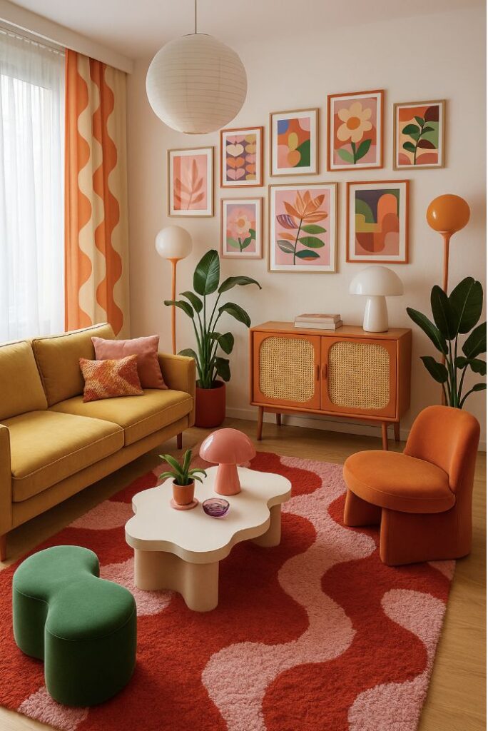
Complementary colors sit directly opposite each other on the color wheel, such as blue and orange or red and green. Using this high-contrast pairing gives a space vibrant energy. For example, a bright teal sofa against warm orange walls can feel bold and lively.
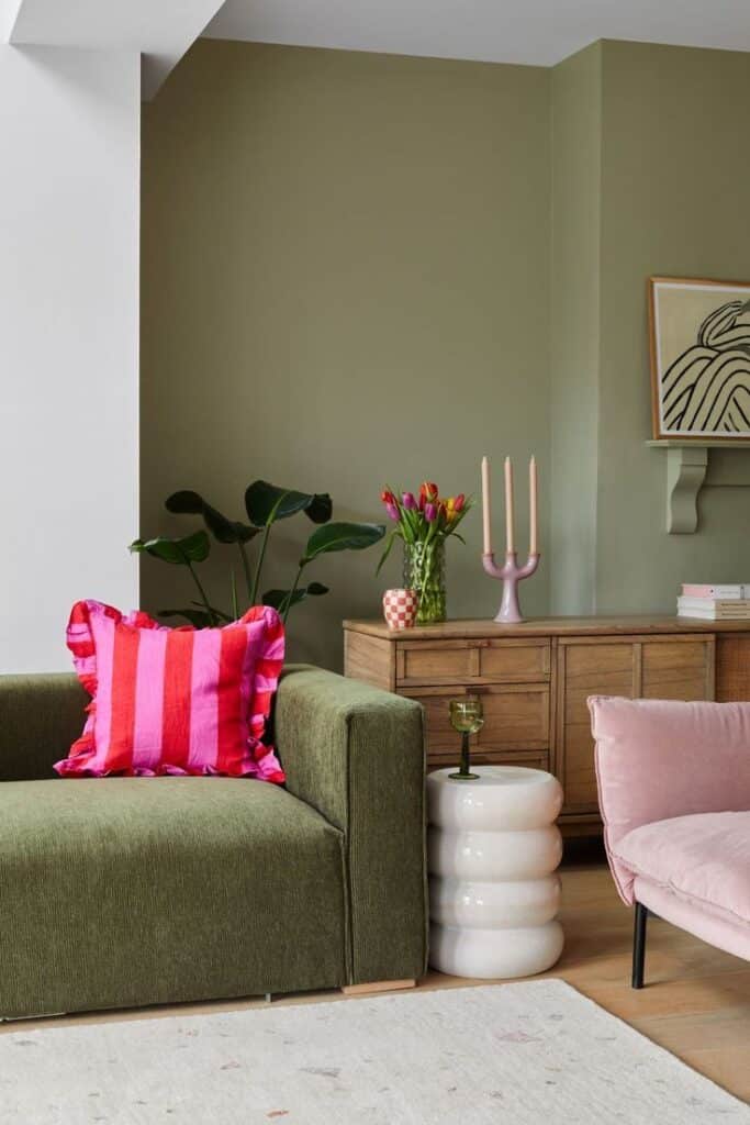
Analogous colors, on the other hand, are next to each other—like green, blue-green, and blue. These groupings are more subtle, bringing gentle variation and blending well. If you want something cohesive but not one-note, analogous schemes offer gentle transitions from shade to shade.
When using complementary schemes, try to balance dominance so one color leads and the other accents. With analogous colors, use light, medium, and dark shades for variation.
Tips:
- Small pops of complementary color can energize neutrals
- Analogous palettes work especially well in living rooms and kitchens
Triadic and Vibrant Palettes
Triadic color schemes choose three colors spaced evenly around the color wheel, like red, yellow, and blue or green, orange, and purple. This approach creates balance and vibrancy without overwhelming the senses.
If you enjoy bold, lively spaces, a triadic palette gives you freedom to get creative. For a balanced look, let one color dominate, use the second for support, and the third as an accent. This prevents the scheme from feeling chaotic.
Triadic and other vibrant color combinations are perfect for playrooms, dining spaces, or any area where you want to encourage energy and creativity. If you prefer softer looks, use muted versions of the triadic colors.
Common Triad Examples:
| Palette | Example Colors |
|---|---|
| Primary | Red, yellow, blue |
| Secondary | Orange, green, purple |
Using Neutral and Dark Tones
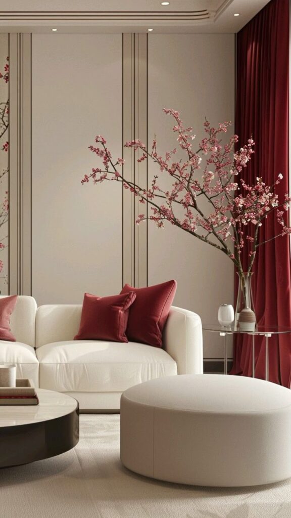
Neutral colors like whites, creams, grays, and beiges offer timeless appeal. They make rooms feel open and airy, serving as a calm backdrop for art or accent pieces. Neutrals can enlarge smaller spaces and allow you to easily change accessories without repainting.
Dark tones—like charcoal, navy, or espresso brown—can provide depth and a sense of luxury. They’re ideal for accent walls or smaller, intimate spaces such as studies or bedrooms. When pairing dark with neutral colors, the result often feels balanced and sophisticated.
For variety, mix several neutrals or balance a dramatic wall color with lighter furnishings and natural textures. Add interest with dark window frames, hardware, or statement lighting.
Quick reference:
- Neutrals = versatile, subtle, timeless
- Dark tones = cozy, dramatic, grounding
Practical Tips for Color Selection
Choosing your home’s color palette involves more than picking a paint color you like. You’ll get the best results by evaluating how colors look in different lights and tying together your space with coordinated accents.
Testing Paint Swatches and Samples
Before committing to a paint color, always test out swatches or samples in your room. Paint a few large patches on different walls to see how each shade looks throughout the day. Use painter’s tape to create clean edges, and label each area clearly.
Compare paint swatches side by side. Notice how your chosen colors shift depending on the time—natural morning light, afternoon sun, or evening lamp light. Dark colors may look more dramatic at night, while light tones might wash out under bright sun.
If possible, leave the swatches up for several days. This gives you a true sense of how each shade feels, helping you avoid surprises after the whole room is painted. Sampling is a simple, low-cost way to prevent costly mistakes, especially with bold or unfamiliar hues.
Considering Natural and Artificial Lighting
Lighting changes everything about color selection. A room with ample natural light will show colors more vividly, while artificial lighting can make shades warmer or cooler.
Start by observing how much daylight each room gets and what direction the windows face. North-facing rooms often have cooler, softer light, so warm colors like creamy beige or gentle yellows can add coziness. South-facing rooms receive more direct sunlight, making almost any color pop.
For artificial lighting, check the type of bulbs you use. Incandescent bulbs give off warm, yellowish light, while LEDs are often cooler or bluish. Test how paint samples look under your actual lamps at night to ensure your chosen shades remain appealing after dark.
Bringing It Together with Textiles and Accent Pieces
Once you have your main paint colors, pull the room together with textiles and accent pieces. Bedding, curtains, rugs, and throw pillows offer a chance to reinforce your palette and add personality.
Introduce accent colors through decorative items like vases, artwork, or blankets. Use the 60-30-10 rule: 60% for the dominant shade (walls or large furniture), 30% for secondary tones (sofas, area rugs), and 10% for accents.
This layered approach helps unify your design, making each room feel intentional and well-coordinated. Textiles are easy to change, so feel free to experiment with patterns and textures that echo or contrast with your main colors.
Collaborating With an Interior Designer
Working with an interior designer can make the process of choosing a color palette easier and less stressful. You benefit from their experience with color, lighting, and spatial planning. Designers bring new ideas and help you refine your style without overwhelming you.
An interior designer will often start by asking you about your tastes, favorite colors, and the atmosphere you want to create. Be open and honest about what you like and dislike. Sharing photos or mood boards can help express your vision.
Designers use color theory and knowledge of interior design trends to suggest palettes that fit your home’s function and style. They also consider practical factors like room lighting, furniture, and existing décor.
Here are a few ways you might work together:
- Review color swatches with your designer and test samples on your walls.
- Ask for input on matching paint, fabric, and accessory choices.
- Discuss your budget and look for high-impact changes within it.
A designer can also help you avoid common color choice mistakes, like picking colors that clash in certain lighting. Their experience ensures each room has balance and flow, creating a cohesive look that’s uniquely yours.
With regular communication, collaborative decisions, and clear goals, you’re more likely to achieve a color scheme you’ll enjoy for years.


